Hypermedia E-book as a Pedagogical Tool in a Graduation Course
Автор: Cristina Portugal
Журнал: International Journal of Modern Education and Computer Science (IJMECS) @ijmecs
Статья в выпуске: 9 vol.6, 2014 года.
Бесплатный доступ
The e-book (www.design-educacao-tecnologia.com) is a support for teaching Hypermedia Design, which constitutes a didactic material to support teaching and research activities for the Design area. The book will gather issues about Design, Education and Hypermedia aimed at offering resources to enhance the use of multiple languages that converge in hypermedia environments, their applicability, techniques and methods in light of Design in Situations of Teaching-Learning. This paper is divided into five parts: the first part introduce the paper subject, the second part shows the e-book Design, Education and Technology, the third part presents the use of this hypermedia e-book as a pedagogical tool in a graduation course in Design, some of the results developed by the students, the fourth part presents the main questions observed about this digital environment and the last part is the conclusion.
Design in situations of teaching and learning, User-experience, E-book
Короткий адрес: https://sciup.org/15014684
IDR: 15014684
Текст научной статьи Hypermedia E-book as a Pedagogical Tool in a Graduation Course
Published Online September 2014 in MECS DOI: 10.5815/ijmecs.2014.09.02
-
I. I ntroduction
This paper is part of a research project called “Contemporaneous Design: systems, objects and culture”, that is being developed in the Post-Ph.D. graduate program in State University Paulista – UNESP – Beazil – it is born from the experience gained in the research work developed during the Post-Phd internship supported by National Council of Scientific and Technological Development (CNPq), an agency of Brazil’s Ministry of Science, Technology and Innovation (2010-2012), which resulted in a teaching material called “Design, Education and Technology”, which received the “Aid for Publishing” (APQ 3) – 2012.2 - Faperj , constituted by two
complementary parts which proposed the experiencing of languages as approached from the printed book, and from the digital book (e-book: . For Gamba Jr.[1], the author, when devoted to the relations of Design with learning, makes this study almost a meta language of contemporaneous knowledge, where new media, informational and cognitive models propose an innovative learning perspective.
The characteristics brought by contemporaneous digital technologies create a new way to conceive and produce design. This study aims to create solutions to reduce this problem and to give interdisciplinary theoretical knowledge which supports discussions about the digital technologies applied to Design learning focused in the user experience aiming the educational, technological development and the innovation with the proposal of helping the propagation and the deepening of this knowledge area.
This paper has a reflection about how to design digital environments that offer quality of experience to the user. It assumes that the user experience is the set of sensations, values and conclusions that the user gets from using equipment. The values coming from this interaction are not products of the functional experience, but also of the esthetical experience. The quality of this experience may be found in the result of the user goals, of the cultural variables and of the interface design.
However, it becomes hard to have an understanding about concepts which fulfill the study about user experience. At first because user experience is associated to a wide range of diffuse and dynamical concepts. Besides, the unity of analysis for the user experience is very malleable, ranging from a single aspect of the individual interaction of the final user with an independent application, up to all aspects of the multiple interactions of end users with the company, and its range of services from multiple disciplines. And, finally, the research panorama in user experience is fragmented and complicated by several theoretical models with different foci, such as: pragmatism, emotion, affection, experience, value, pleasure, beauty, hedonic quality, etc. [2].
This discussion is justified, because today there is available a large amount and diversity of literature about usability for software, games, sites, etc. However there are insufficient data determining guidelines for a joint line of work between Design and the several areas which must collaborate in the construction of multimedia systems for learning which consider the user experience in the teaching and learning process.
This shows the fragility of a conduct lacking criteria in development and utilization of contemporaneous digital technologies in education and the direct consequences of this shortage is an expressive distance between the regular teaching in schools and universities and the possibilities of teaching-learning made available by the new media. This fact becomes more serious in the teaching and formation in design, since a designer must be a translator of signs and languages and, therefore, must be ready to understand and act with the contemporaneous technologies, present and disseminated by the systems and digital languages related to information and communication. If the teaching and formation in design does not allow the access, involvement and knowledge of those technologies in its primary base, which professionals and researchers are we forming for the next future?
This paper is divided into six parts: the first part introduce the paper subject, the second part presents a brief discussion about the concept of user experience, the third part shows the e-book Design, Education and Technology, the fourth part presents the use of this hypermedia e-book as a pedagogical tool in a graduation course in Design, some of the results developed by the students and arranged in the class group created in Facebook page, the fifth part presents the main questions observed about this digital environment and the last part is the conclusion.
-
II. Design, Education and Technology
Further according to the authors created in Interdisciplinary Laboratory of Design/Education – DAD PUC-Rio as a result of experiences related to Design in Education, ‘Design in Situations of Teaching-Learning’ is a line of research preferably inserted in the academic field and that agglutinates works where there is designer participation in projects geared towards Education at any level - Nursery, Elementary, High School, Higher and Advanced - as well as for studies and research related to the teaching of Design in the extra-university, technical, extension, undergraduate and graduate ambits. Its basic principle is to enhance the knowledge acquisition process through artifacts, environments and analog and digital systems. In this perspective, each Design solution represents the search for equilibrium between interests and needs of the teacher and student, as well as of educational institutions.
How the information is made available, transmitted and organized in learning environments implies a series of factors that shall contribute towards the teaching and learning process or not, altering relationships and implies interactions between teachers and students. Assuming that the work with the student of contemporary cannot be limited to the reading and writing process, but rather to an entire language acquisition job, in this study, we intend to address methods for the hearing impaired to acquire hypermedia language within a multisensory perspective.
This presented a project in the leading edge of the worldwide development of the Hypermedia Design area. It intends to provide theoretical and esthetic reflections on Hypermedia Design as well as to discuss the role of
Design in the development of digital environments, with the intent to promote the enhancement and enrichment of the construction of legible communicative discourse in hypermedia systems, taking into account the concepts of a new time of connectivity, interactivity and nonlinear navigability.
The use of the digital environment (e-book) Design, Education and Technology during the teaching and formation in design, gives for Design students a hypermedia tool aiming to collaborate in the teachinglearning process. The contents which compose this version of the e-book are presented in a non-linear way, bringing theoretical and esthetic reflections about the role of Design in the development of Hypermedia environments. The text present in the book is supported by several pictures and bibliographic references. The item about information that complements the main texts must be highlighted. It offers a selection of books, sites, games, videos and apps which stimulate the book user to go deeper in each particular theme.
The e-book content contemplates themes such as: color, typography, image, accessibility, usability, cognition, interaction, materiality, process, technology, reception. Those are some of the questions necessarily involved in the interface between human and physical reality. For Gamba Jr. [2], this is where is founded the challenge and value of Design. The author Cristina Portugal faces this complexity with the systematization needed for keeping the projectual method. Today it is possible to really elaborate a knowledge that allows to coincide, overlap, or to put in dialogue knowledge areas normally set apart by culture, but generously amalgamated by Design.
Thus, in order to analyze the use of this e-book as a contemporaneous pedagogical tool in the area of Design, workshops about the theme were developed in seven classes of the third period of the graduation course in Design. Each class went through three stages during the e-book evaluation, which will be presented below.
In the first stage the e-book was presented as a supporting tool to Design teaching with the updated content of the class using the e-book – Module Color – a video was played with basic concepts about color and theoretical concepts about hue, value, saturation using the digital environment Design, Education and Technology.
The content of the e-book to be made available in each module can be seen in the figure 1 below:
Interface Design Information 1 Design j, "=”8»"" i«e« ™»r
L'"'lv’- oidactis Design Interaction
■ Concepts Educatiorrande W Accessibility
. Flexibility Tecnology Design
Content
‘- ^fcCollor * tonmunicability
Convergence". . ■ _ ■
0# Languages \ .'
тес-сьТ н”;;™сЕлс1:1 j™8«, Multimedia". ■ - |- ]та^е
Fig. 2: E-books themes f Portugal and Couto [6]
Each theme of the e-book's content was developed on topics and sub topics will be presented as an example the theme Hypermedia Design –topic color and the sub topics. Color content; introduction; Hue (CMYK subtractive color; RGB additive color.; chromatic harmony); Saturation (Chroma); Value; contrast; Syntax and Relationships (Syntax and taxonomic relationships semantic relations); bibliography; Learn more/Sites/Applications
Below will be shown some of the screens for the first theme, already developed – Hypermedia Design/ Color. Fig, 2 and 3.
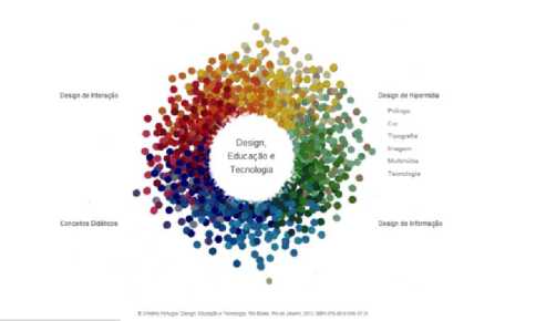
Fig, 2: Home page of the e0book Design, Education, and Technology by Portugal [7]
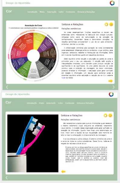
Fig. 4: Screns from hte e0book Design, Education, and Technology by Portugal [7]
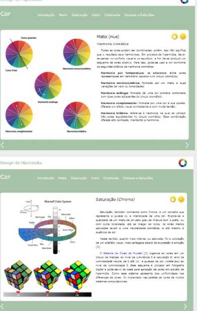
Fig.. 3: Screns from hte e0book Design, Education, and Technology by Portugal [7]
-
III. T he activity
The activity of this class was based in content learned by the students; they had to create a line of products (chocolate truffles). Each student in a group should develop a truffle respecting the Design style determined by the group, and the shape and colors should be in accordance with the goal and target group of the project.
For development of the line of truffles the students had to relate color with – flavor – aspect/shape – goal/target public – project resources. Each student should create a truffle using modeling clay according to criteria defined by the group. The access to contents in the e-book is open for research or for solving questions. At the end, the truffles developed by each student should be adequate in order to create a truffle line.
Some of the results developed by the students and arranged in the class group created in Facebook page.
Theme: Classical Music
Project Name: Symphony of Emotions
Members: Alena Miklos, Nelson Donato, Tatiana Moniz
Objective: Make a collection of delicious and refined bonbons, which reminds the consumer about feelings and classical music, being the ideal gift to people who considers themselves lovers of chocolate and music. Target Audience: Adults and lovers of classical music in general.
Planning: First we separated feelings in three "types": Strong Feelings, like love, passion, anger etc; Soft Feelings, like fondness, happiness, harmony etc; and Calm/Sad Feelings, like melancholy, peacefulness, sadness etc. After this, we chose the colors that would be used to make the bonbons based on these feelings, and already thinking about the music that could represent them. The first of them (Top Left) stands for the Voices of Spring Waltz and Soft Feelings. This way, we chose "white chocolate" for the base, as well as pastel colors and a gentle spiral coming out of its center, representing the softness and fluidity that we feel when we are happy. The second (Top Right) represents the Habanera Aria, from the Opera Carmen, and Strong Feelings. Therefore, we opted for a "darker chocolate" for the base and hot colors, standing for the strenght of passion and anger. We also opted for those colors and elements (the rose and the "Torero's spears") to remind even more about the music and the duality of these feelings. The third (Bottom) represents the Swan Lake Waltz and Calm/Sad Feelings. We chose "Milk Chocolate" as the base and the color blue because it remebers about sadness, but at the same time, calmness. The Blue-Light Blue "braid" shows the mix of these two types of feelings, which can be felt both in the waltz as throughout the ballet. Result: The bonbons ended being able to represent the musics and feelings chosen pretty well. Furthermore, we were able to make them "fit", creating a heart shape with the help of a black background with the same shape. (written buy: Alena Miklos, Nelson Donato, Tatiana Moniz).
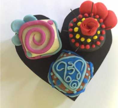
Fig. 5: Symphony of Emotions
The activity results should be describing in Facebook page aimed that all students from the class could see the project of the others students. The e-book could be consulted to search information about color as Hue (CMYK ) - subtractive color; RGB – additive color; chromatic harmony), chroma, value, contrast, syntax and relations (syntax and taxonomic relationships, semantic relations or others informations necessary to do the activity during the class. Also the students could access the e-book page that’s calls “learn more” that can help them using the colors.
Fig. 6: Symphony of Emotions in Facebook page
Theme: Domestic and sexual violence against women
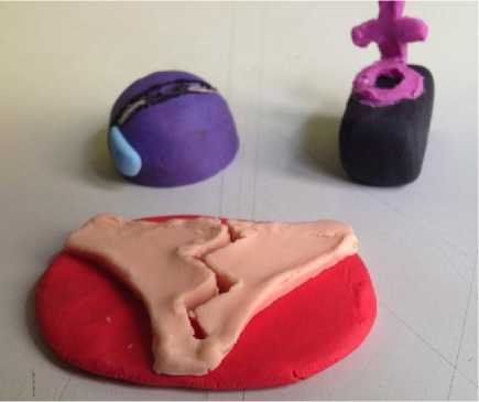
Fig. 7: Till death do us part
Title: Till death do us part
Students: Mauricio Einhorn, Guilherme Moyna and Luma Rodrigues
Objectives: Impact and warn people about the problem of domestic violence against women, aiming to increase complaints. Target: Adults and young people who have had or who have never had contact with women in situations of violence.
Planning: Before making the line of chocolates in question, we wrote keywords to be our guide: woman, aggression, injuries, victim, rape. Then, from such concepts, we drew sketches of possible candies on paper. The experimental ideas were, among others, a woman lying on a platter with an apple in her mouth, a woman's deformed face, the female symbol of Venus being pierced by a bullet, a woman tied on a cutting board, the female pictogram commonly used to identify public toilets looking like a corpse on the ground. We decided that all of the candies should be made with bitter chocolate and have their filling in red color, a little bit acid, in order to symbolize the painful and unpleasant nature of this kind of crime (through the tasting of the candies). About the color palette, as an element of cohesion, we chose to use pink or similar colors on all chocolates, alludind to the feminine and we also chose to use colors which could create the sensation of anguish and death, such as red and black.
Result: We reached three final products of the line of chocolates: a purple half-sphere alluding to a black eye, with details of cilia and a tear in blue; a black parallelepiped to represent a grave and, over it, the feminine symbol of Venus in pink, with the circumference over the parallelepiped and the cross bending in 90º with it, sugesting a form of tombstone and here there's a kind of intertextuality with a certain artwork of the brazilian cartoonist Latuff; a feminine torn underwear in light pink over a red plan, suggesting sexual violation and bleeding. (written buy: Mauricio Einhorn, Guilherme Moyna and Luma Rodrigues).
Fig. 8: Till death do us part in Facebook page
In the second stage the e-book Design, Education and Technology of Cristina Portugal – Module Color – is presented, aiming to make available for the student a material for theoretical study and strategies to allow the access to several experiences in the use of color. For development of activities, the stages followed were:
-
1. Expository class with visual resources about color theory.
-
2. Experiences with chromatic harmonies from primary colors.
-
3. Formation of groups - Brainstorm with the goal of representing, by chromatic harmony criteria, the theme defined by the students.
-
4. Selection of one criteria of chromatic harmony and creation of a color palette communicating the project theme (objective and target public).
-
5. Development of layouts of a color composition representing the project theme of each group. The composition created should be brought in the next class, specifying contents learned during the class and which re-sources of the e-book were used for deepening the theme.
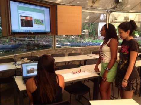
Fig. 9: Studentes ctivities in classroom
In the third stage the e-book Design, Education and Technology of Cristina Portu-gal [6] – Module Color – is presented, aiming to work with the students the taxonomic and semantic relations. In this class were discussed the taxonomic relations about the use of color to organize, prioritize and highlight information, also enabling other applications, such as creating perception plans, directing and/or masking the reading, as well as treating the semantic relations of color which comprise its use for acclimatize, symbolize, denote or connote.
The digital resources available in the e-book during the class were video (Beau Lotto: Optical illusions show how we see), images and links for deepening the theme. As an activity for this class a brainstorm was performed aiming to represent, by taxonomic and/or semantic relationships of color with project theme. The proposed activity was to develop a poster about the project theme that the students should have been developing in the discipline “project 3”, considering that the color may be considered an information every time that its application is responsible by organizing and prioritizing data or when it can attribute some meaning, in other words, acting individually or integrated and dependent of other elements. The result expected from this exercise is the possibility of communication by color and other graphical resources of each group’s project theme.
-
IV. M ain Q uestions O bserved
Main questions observed in interviews with students during observations collected from students of the graduation course in Design about using the e-book Design, Education and Technology of Cristina Portugal as a teaching resource for the teaching-learning of Design.
Main questions observed
About number of accesses: Most of students accessed hypermedia from 0 until several times;
Generally, the accesses were related with three factors: performing active ties, individual learning process and ease of access during class.
Availability of information: The Wi-Fi network available, in classrooms, collaborated both during presenting the content of e-book Design, Education and Technology as well as during the development of activities, because the students with their laptops, tablets and smartphones could use the available resources such as videos, links, e-book sites easing the search of contents needed for development of tasks.
Among the mostly mentioned contents were the ones related to the development of activities; such as developing the color palette for building the boards for presenting the works.
Some students identified that the videos played in classroom and then posted on Facebook contributed for the learning about color content. It was observed that videos posted in Facebook were viewed by a large majority of students in each class.
About readability: Almost all students considered the e-book text as readable in their personal computers; however when exposed via data-show in classroom it was necessary to magnify them, so that the students could read.
Association between readability and amount of text was a favorable item, because the students considered the contents as knowledge pills that could be deepened in the e-book itself, as well as in references made available on the field “Learn more”.
Content organization: A large part of students understood the organization of color contents. They considered that the e-book content, as a whole, eased the development of tasks, since the e-book offered theoretical and aesthetic concepts about the Design field as a whole.
Text language used: Consistent information.
The volume of text on screen was considered large for some students.
Considered to be adequate to the use context;
Good receptivity from students to the use of images as examples of content and, specially, videos.
Features found while navigating: Students considered easy to navigate the system and find the links on the landing page; some have difficulty in finding the link for the landing page.
The menu and advance/return buttons were mentioned as easier to use navigation tools.
Association between media resources: Generally, perceived as adequate by students;
The most celebrated association by students was between text and video, image and text, perceived as fundamental for understanding the context.
Navigation path and completeness of search results: Some students have difficulty identifying the navigation tools; such as the icon for bibliography and the one for “Learn more”.
Generally, opening modules in new tabs caused confusion in students;
The field “Learn more” was considered as important by students for deepening the content, however many did not use it by lack of time.
Generally the e-book content highlight was the clarity in organization and presentation of contents, simplicity and easiness of navigation, consistent presentation of information.
-
V. C onclusions
To finish, when analyzing a hypermedia pedagogical tool it was verified that regarding usability, the experience is normally defined considering the ease of use. However, the experience encompasses more than only function and flow, but the understanding compiled through all senses. For Shedroff [8], the user experience is about the global, general or specific experience that a user, customer or member of the public has with a product, service or event.
According to Couto [9], in today’s society, full of changes, the need of reevaluating teaching practices is pressing, leaving aside traditional methodologies. In order to that, the new trends and the use of innovative material must be considered. In this sense, the e-book of Cristina Portugal constitutes an invaluable source of research.
Teaching demands research. There is no teaching without research and research without teaching. Teaching demands critical reflection about practice. That is why, in the permanent formation of the teacher, the key moment is the critical reflection about the practice. It is by thinking critically of the practice of today or yesterday that the next practice can be improved [10].

