Interpretation of the Selected Text Fonts with Their Typographic Features from the Web Sites of the Computers of the Users

Author: Goran Bidjovski
Journal: International Journal of Image, Graphics and Signal Processing(IJIGSP) @ijigsp
Article in issue: 12 vol.5, 2013.
Free access
The subject of the research in this scientific paper is the text on the Web pages, with special emphasis on the interpretation of the text fonts chosen by the Web designer, along with its typographic features, on computers of various users. In addition, users can have different operating systems, different browsers, and different preferences in terms of their computers settings. An overall direction of the choice of fonts and their characteristics when designing Web pages, as well as some advice and opinions on the same topic are presented here. After that, several problems which arise from the interpretation of the text on the Web pages of the users are analyzed, for which a few solutions for the problems, as well as recommendations on which solution when to be chosen are also given in this text. The problem of having no fonts, chosen by the designer, on the user's computer is studied as well. Then, the possibility of the users to change the default font, given by the designer, on their computers, and the possibility to change the typographic features of the default font is also analyzed. Finally, the problem with incompatibility with different operating systems and Web browsers in visualizing the fonts is also considered.
Web design, features of fonts for text, interpretation of text on user’s computer monitor, harmony of Web site, composition of Web site
Short address: https://sciup.org/15013154
IDR: 15013154
Text of the scientific article Interpretation of the Selected Text Fonts with Their Typographic Features from the Web Sites of the Computers of the Users
Published Online October 2013 in MECS (http://www.
-
I. INTRODUCTION
“Design is not just what it looks like and feels like. Design is how it works.” Steve Jobs, 24/02/1955 - 05/10/2011
Web design is a process of creating, planning, modeling, and implementation of electronic media records that are transmitted over the Internet in a form of technologies suitable for interpretation and display on computer through an Internet browser or other Webbased graphical user's interface.
The Web design of a Web site should satisfy all the technological requirements, but also the Web site should be attractive enough to attract more customers, especially the target users for whom it is intended.
The Web design process can be seen as a combination of creativity and technical work. The creative work includes artistic creation of individual graphics and multimedia elements, simple and interactive animations, text formatting, etc.
The technical work includes deployment of these elements with code, which is then visualized in the output device. [1]
Web sites contain a variety of different graphic elements in their structure. In general, the text is the most widely spread from all the graphic solutions in the content of Web sites. The basic part of the most Web sites is the text (fig.1).
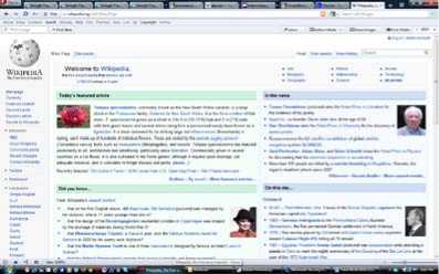
Figure 1 -
Of course, there are also visually rich Web sites filled with photos, illustrations, animations, videos, etc., where the text is in the background, but those sites are more an exception from the general rule. They are usually made for specific areas, as for example: design, photography, visual arts, etc. (fig.2). [2]
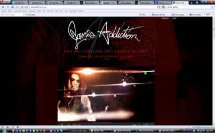
Figure 2 -
Although the text characters, in the narrow sense of meaning, do not represent graphic elements, they, by contributing to various visual perceptions of the site, can be placed in the group of graphic elements of the Web design. Also, like the other graphic elements, the text can show emotions (mood), can add importance to a certain element, it can be associated to something etc.
The display of the text can send two messages. The first one is obvious and is sent through the content of the text. But there is also a second message, which is suggestive, and is transmitted by the choice of the font.
Each font, depending on its visual characteristics, speaks for itself, and thus it transmits the hidden message sent by the designer. Different fonts imply different things, different desires, ambitions, attitudes, etc., and different fonts are used for different purposes, so the user, by reading the text, subconsciously receives the second message. Even without reading the text (or not knowing the language that the text is written in) with the visual perception, the suggestive message is clearly transmitted.
-
II. STUDY AREA
When using a text on a Web site, it is recommended to choose one font for the body text. In most cases the font of body text is selected from the most frequently used fonts. [3] [4]
According to the style of the characters (signs) of the fonts for Web sites, the following families of fonts exist:
-
• serif (proportional fonts, where the characters have different widths, matching their scale and serif decorations at the end of the contours of characters) (fig.3);
-
• monospace (disproportionate fonts, in which the characters are with fixed width, similar to the text written with a typing machine) (fig.5);
abcdefghijklm nopqrstuvwxyz
Figure 5 – monospace font
-
• cursive (fonts, which are trying to resemble the hand-written text) (fig.6);
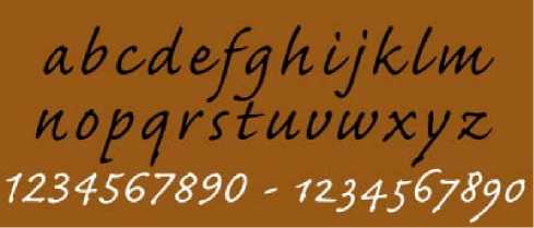
Figure 6 – cursive font
-
• fantasy (decorative fonts with a strong graphic
look) (fig.7). [5] [6]
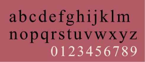
Figure 3 – serif font
-
• sans serif (proportional fonts without serif decorations) (fig.4);
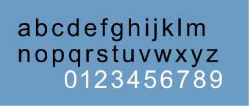
Figure 4 – sans serif font
-
Figure 7 – fantasy font
The cursive and fantasy fonts are more decorative, while the others are clearer.
The serif fonts and sans serif fonts are the most used ones. Among the serif and sans serif fonts, the sans serif is used more, because they are composed of homogeneous contours, which are easier to read on the screen and they are visually more attractive. [7] [8]
-
III. RELATED WORK
Combining serif and sans serif fonts is perfectly acceptable (if combined in the correct way), in many situations is even recommended. [3] [9]
The titles will be more effective if they are clearly different form the basic text. Typically, a larger font size is used (fig.8). In addition, the header can be emphasized by using a different font.
Figure 8 -
In order to emphasize the header from the rest of the text it can be written in a serif font and the rest of the text can be written in sans serif fonts (fig.9). This combination has proved to be successful many times and a lot of Web designers are accepting and applying it. [10]
Figure 9 -
The title font is recommended to be non-standard. Having a larger font size and/or bolding it often ensures a sufficient contrast. A strong emphasis on Web pages may be added by using titles shaped like GIF (Graphic Interchange Format) images (fig.10). [11]
Figure 10 -
When using a text for a link, one font for all states of text links can be used, in order to avoid the "jumping" of the content of the hyperlinks when changing the font. [8]
This can be caused by the fact that, although the size of the letters remains the same, some fonts may be slightly larger or smaller, and that they can have different width of letters (sometimes such behavior of the text links is recommended, especially for funny, youth sites).
If, however, the designer opted for different fonts at different conditions of the text links, visually different fonts are recommended to be chosen, where the intention of the designer to put an accent to the possibility to make a linking connection to another site with eventual click on the specified text will be obvious.
When selecting a font for the basic body of the text, one should always first pay attention to its readability. The principles and rules, which are valid when choosing a font for printing, are not valid when choosing a font for the computer.
The font, which looks beautiful in a printed form, may not endure transition on the Web. Printers with high resolution are favorable to artistic fonts. The reality of the computer screen is completely different. It has a limited number of pixels, with which each character should be presented. In future, monitors with a resolution which will be competitive to the laser printers will certainly be used, but until then it is best not to use sophisticated fonts instead of those developed specifically for computer screens. [3] [9]
The basic rules for choosing a good, readable font for screen monitors are:
-
• The choice of a font family. One should always choose a font, designed for an application on the screen. Sans serif fonts are usually more readable on the screen because the monitors reproduce the fine lines of the serif fonts harder. Sans serif fonts with decorative changes in the contours of the letters are just as hard to read on the screen, as the serif fonts. Because of that one should pay attention when using decorative sans serif fonts for screen publications.
-
• The size of the letters. Typically, 12 pt is used for the basic text in the electronic publications.
-
• The line spacing. In electronic publications, should be 4 or 6 pt +, which means that when using 12 pt texts, there should ideally be 16 or 18 pt leading on the screen. [12]
There are many program languages and program codes for creating Web pages. With each of them, more or less, graphic elements are also possible to be added.
Here are some of the most famous among them in terms of interpreting the selected text fonts with their typographic features from the Web sites of the computers of the users.
With Cascading Style Sheets (CSS), complex typographic elements can be managed, such as the font choice where may indicate more fonts and a choice from font families may be suggested.
The Hypertext Markup Language (HTML) supports the style characteristics, which offers the Web browser a choice of font from a specified font family.
-
IV. CONTENT
In this part of the scientific paper are four problems that arise from the interpretation of the text of Web pages of the users’ computers are analyzed.
There are a few solutions for the problems, as well as recommendations which decision when to be made.
-
IV . 1 Problem with the lack of defined designer fonts on the user's computer
With the interpretation of the text from the Web site on users’ computers, one of the major problems is the lack of certain fonts on some of the computer users.
Web pages are rendered (visualized) in a direct dependence of the browsers and computers of the users. In the fields of the Web pages filled with text, in the code of the pages, certain fonts are given with which the designer wants the text to be displayed. [3]
But if the computer whose browser has been processing the font which is not installed at all, the whole text, coded accurately from visual point of view, will be interpreted with different fonts from those given by the designer (usually the fonts set by default on the browser). Normally, this will destroy the designer's vision of how the Web site should look like. Because of the different parameters of the various typographic fonts, a complete different set of the structural elements of Web pages can appear which can then cause difficulties in the functionality of the site.
In order to resolve this big problem there are several solutions. I will offer four solutions and will elaborate their advantages and disadvantages.
One of these solutions is using only standard fonts installed on computers. Fonts, about which we can always be sure (almost always) that they are installed on the computers of the visitors of the site are those fonts which come with the Windows or Macintosh operating system, or the fonts installed when installing the relevant browser. Their number, of course, is not large (it varies among 10 to 30, depending on the version of the operating system and the version of the browser) and mainly those are the fonts that are very popular and commonly known.
By using these fonts the user will be in familiar surroundings and the atmosphere of the site will be also familiar. With that, the user will feel as if they are in a well-known field and a friendly environment.
But, the typographic solutions of the Web designer are seriously limited by using only those fonts, and with that the sites will lose on their creativity. For one Web designer, the uniqueness and the authenticity of their sites are very important. Regarding this solution of the text problem, they will be impaired.
The emergence of the phenomenon of Web design as a special part of the scientific field of graphic design is caused by the need to create sites which are visually and functionally different from the most existing sites (in a positive sense), which with the solutions given above this is not possible.
The second option for resolving this problem is the addition of several alternative fonts. Defining a group of fonts instead of just one font, increases the chances that the visitors to the site will have at least one font installed from the list of fonts on their computers (1). The browser will try to display text with the first font from the group, but if the font is not installed, the browser will move on searching in the group of fonts. [6]
.STYLE4 {COLOR: #9D0301;
FONT-FAMILY: EUROSTILE, BETECKNA, HELVETICA, SANS-SERIF; (1) FONT-SIZE: 14PX ;}
The order of the fonts is important – the browser will search for the first indicated font (in the example 1 the font is Eurostile), and if it is missing then it will search for the second indicated (Beteckna), then the third (Helvetica), etc. In case none of these fonts are installed on the computer of the user, as an option, the whole family of fonts can be included in the list (sans serif), so that an opportunity is given to the browser to choose some of the available computer fonts which belong to a particular family. This is a kind of last option for the designer to get what they want.
When applying this solution the designer has a task to check the visual appearance of the Web site with multiple fonts so that the visual impression should always be relatively satisfying.
In seeking alternative fonts, an attention should be paid to the point that the new fonts are visually more similar to the first selected, as well as their typographic features (width, height, etc.) are relatively identical.
The third solution to the problem with the lack of fonts is the text to be recorded as an image in some of the graphical program packages. With certainty, every text which can be saved as an image in GIF or PNG (Portable Network Graphics) format will be shown as the designer has created it, regardless of the fonts used by the browser (fig.10). [13] [14]
The weakness in this solution is that the size of the images (in terms of the amount of data that occupy the computer memory), which has replaced the text, is much larger than the size of the set of text characters. Thus, the size of data which need to be transferred with opening a Web page will increase several times, and this will also increase the time of the page downloading. Today, when there are millions of sites with the same or similar subject matter, the speed of download represents one of the most important parameters when choosing which Web pages will be opened. [15]
Another problem is that the images of the words cannot be searched by the Web search engines, the words cannot be copied and pasted, and the images of the words cannot be read by the screen readers.
This approach should be used with caution. Everything which is longer than a sentence should not be transformed into an image. [16]
Graphic texts are usually used for headings, subheadings and banners, which are often found at the beginning of the page.
If there is information that part of the users of the site who have vision problems (see less or do not see at all and use screen readers) are a part greater than a few percent, then the offered solution should not be used.
The fourth solution is to use embedded fonts. The concept of embedded fonts allows one or more fonts to be downloaded from the Web browser along with the page content (2).
@FONT -FACE {
FONT-FAMILY: 'FONT NAME HERE';
}
In this case the page will look exactly as it was imagined by the designer. There will be a hundred per cent certainty that the designer's vision of the Web site is interpreted correctly on all users’ computers. The problem here is that the size of the Web site will increase (as much as the size of the required fonts), and this will expand the time required for downloading the site. It takes a lot of time to transfer and install fonts.
Also, another problem is that Windows and Mac fonts are not compatible. It will be necessary to include versions for the both platforms.
When using this solution, there can sometimes be problems when installing the fonts because of the various system characteristics and constraints of the various computers and their various versions of operating systems.
-
IV .2 Problems with the possibility of the users to change the font defined by the designer on their computers
Another problem of this field is the possibility of the users to change the font specified by the designer in the interpretation of the text on their computers.
The visitors of the Web sites have the final control over the selection and characteristics of the fonts. The users can always choose to use fonts which they like more by replacing the fonts selected by the page designer (fig.11) (fig.12). [17]

Figure 11 -
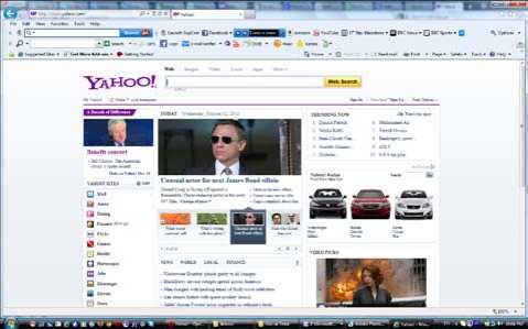
Figure 12 -
The changing of the fonts, many times, can be carried out not only for aesthetic and design reasons but also for visual reasons (for example - users who have a problem with the eyesight).
As I stated above, by changing the specified font, the design composition and the visual concept of the Web site can be greatly disrupted. In order to disable this option for the users, the entire text of the site should be transformed in graphic images. This, on the other hand, will increase the size of the Web site drastically, which, of course, is not good. Fortunately, many of the users are not familiar with the possibility to control the font, which means that they will not use this "benefit".
From the analysis which I've done on students of graphic design, who are considered to be much more familiar with the Web design, It can be determined that great part of them (about 80%) are not familiar with the possibility to change previously specified font from the designer on the user's computer. For the ordinary users this percentage is certainly much higher.
There are many Web sites, in which the text is saved as a graphic. Those are usually sites, in which the emphasis is placed on the design and in which the content is limited (fig.10).
-
IV .3 Problems with the possibility of the users to change the typographic features of the default font on the user’s computers
A similar problem of this topic are preferences of the users regarding the typographical characteristics of the fonts (usually it is the font size) with which the text is written on the Web pages.
The users have different preferences in terms of font size and other typographic parameters than those specified by the Web designer. Therefore the design should look good at both smaller and bigger size (fig.13) than from the designer's preferred font size.

Figure 13 -

Figure 15 - (Mac)
As I said above, it is good that majority of the users do not know about this possibility, so only a few users will change the font size, and often these changes will be made by that group of users with eyesight problems and this change will be fully justified.
We are talking not only about the aesthetic appearance of the Web site, but also about the possibility or impossibility of the Web site to be properly and fully seen and used. For these users the functionality is of main importance, rather than the design of the Web site.
-
IV .4 Problems with the incompatibility with different operating systems and Web browsers in visualizing the fonts
The incompatibility of the various operating systems and the Web browsers in the way of visualizing the same HTML code is one of the biggest problems faced by the Web designers.
In terms of the text on the Web pages, the Windows operating system (fig.14) is visualizing the font with a larger size than Mac (fig.15). This situation can lead to a design that looks great in the Mac, but there is a huge text in Windows. [18]

Figure 14 - (Windows)
Also, the design which is exactly positioned on the Web browser Google Chrome (fig.16), can be destroyed only with a few pixels in Internet Explorer (fig.17).

Figure 16 - (Google Chrome)

Figure 17 - (Internet Explorer)
The solution to this problem is to use programming language JavaScript and numerous CSS style files, customized for different operating systems (3) and browsers. A variety of styles which are designed for certain operating systems and browsers, with which the visitors will see the site, should be created, so that the users will only see the style which suits its technical features.
< SCRIPT TYPE = "TEXT/JAVASCRIPT">
VAR CSSTYPE ="INLINE"//SPECIFY TYPE OF CSS TO USE. "INLINE" OR "EXTERNAL"
VAR MAC_CSS ='BODY {FONT-SIZE : 14PT;}'//IF "INLINE", SPECIFY MAC CSS HERE
VAR PC_CSS ='BODY {FONT-SIZE : 12PT;}'//IF "INLINE", SPECIFY PC/DEFAULT CSS HERE
IF (CSSTYPE ="INLINE"){ (3)
IF (MACTEST)
ELSE
}
ELSE IF (CSSTYPE =="EXTERNAL")
The disadvantage of this solution is that in order to create multiple versions of the code of the page (more styles) a lot of time and effort is required, and this will increase the price. Also, the size of the file will increase and with that the downloading will go slower. (3)
-
V. CONCLUSION
From the above mentioned it can be concluded that this area is extensive and offers many opportunities for research and analysis. Due to a large number of problems which occur in this area, usually there is not only one correct solution.
For choosing the most appropriate solution a lot of data should be collected for the potential users, their desires and habits, as well as the technical features of their computers, and depending on that solution to be found. Sometimes, depending on the situation, it is possible to apply a combination of multiple solutions simultaneously.
When we have the input parameters, with the help of the JavaScript program language, one may be offered a choice of several different solutions, which depending on the situation (the parameters of the user's computer), a precise solution may be offered.
From the aspect of the need to satisfy the larger part of the market of potential users, this is a great solution because for different groups of users an appropriate solution will be offered. In most of the situations with problems of this type, this solution is selected and recommended by a big number of Web designers.
On the other hand, the size of the Web page will be increased and with that, the downloading time will also be increased. Today, when there are millions of sites with the same or similar topics, the downloading time is one of the main parameters when choosing which Web site to visit.
Also, because it will be necessary to create more solutions, the time required to prepare the site will be increased and with this the cost of production will be higher. These parameters also influence the final decision for the solution of the problems.
All these aspects should be considered when deciding which solution to choose to resolve these problems.
The conclusion is that there is no universal solution for all the possible problematic situations in the interpretation of the text with pre-determined typographical parameters.
It should also be noted that the abundance of a variety of program languages and codes allows other solutions too, depending on the used languages and codes.
This subject, as well as everything else on Web design, is very progressive. There are various new innovations and opportunities which will undoubtedly produce some other possible solutions for the problems in this science area.
References Interpretation of the Selected Text Fonts with Their Typographic Features from the Web Sites of the Computers of the Users
- Ivanova Nezabravka; "History of Design"; Science and Art - Sofia, Bulgaria, 1984 Chen Tianhua. Digital Image Processing. Beijing: Tsinghua University Press, 2007.
- Toms Justine, Belogusheva Gorica; "Web site, the mission obligatory"; Ciela Soft and Publishing Corp., Bulgaria, 2009.
- Gray Daniel; "Looking good on the Web"; Coriolis Group LLC., USA, 1999.
- Atanasov Aleksandar Petkov; "Informative and compositional semantic foundations of Web design", PhD, in "Ergonomics and design", Bulgaria, 2008.
- SoftPres publishing team; "Creating Web pages"; SoftPres Ltd., Bulgaria, 2001.
- SoftPres publishing team; "CSS in easy steps"; SoftPres Ltd., Bulgaria, 2006.
- Millhollon Mary; "Faster smarter Web page creation"; Microsoft Press, USA, 2003.
- SoftPres publishing team; "HTML in easy steps"; SoftPres Ltd., Bulgaria, 2005.
- Cohen June; "Unusually useful Web book, 1st edition"; New Riders, USA, 2003.
- Parker Roger C.; "Looking good in print"; Coriolis Group LLC., USA, 1999.
- Nielsen Jakob; "Designing Web Usability: The Practice of Simplicity"; New Riders, USA, 2000.
- Adobe Creative Team; "Adobe Photoshop 6.0 Classroom in a book", Adobe Press, USA, 2000.
- Niederst Jennifer; "Web Design in a Nutshell, second edition"; O’Reilly & Associates, Inc, USA, 2001.
- Davis Jack, Merritt Susan; "Web Design Wow! Book"; Peachpit Press, USA, 1998.
- Teague Jason Cranford; "DHTML and CSS for World Wide Web, Third Edition"; Peachpit Press, USA, 2004.
- Karbo Michael B.; "Webgrafik - lær det selv"; IDG Denmark Books, Denmark, 2001.
- Willard Wendy; "HTML: A Beginner’s Guide"; The McGraw-Hill Companies, USA, 2001.
- Page Khirstine Annwn; "Macromedia Dreamweaver MX 2004: Training from the Source"; Macromedia Press, USA, 2004.
