The brand of the Nenets Autonomous Okrug as a Euroarctic Storeroom of Russia

Author: Treskin V.G., Bormotov I.S.
Journal: Arctic and North @arctic-and-north
Section: Management, economy, regionology
Article in issue: 6, 2012.
Free access
Authors consider process of development of a territorial brand of the Nenets autonomous region as the Euro-Arctic store room of Russia. The necessity to develop a territorial brand in addition to heraldic symbols is substantiated. The author describes the brand, gives an interpretation of its visual components. The article contains a description of target groups, describes practical results of brand use.
Territorial brand, regional branding, Nenets autonomous Okrug, territory development, investments
Short address: https://sciup.org/148320448
IDR: 148320448 | UDC: [332.12+338.2+659.126.3](470.111)(985)(045)
Text of the scientific article The brand of the Nenets Autonomous Okrug as a Euroarctic Storeroom of Russia
The regional communities are increasingly resorting to the use of regional branding tool to solve problems involving the territory of the new residents and tourists, to increase the flow of investments for the development of priority sectors and the implementation of important projects that create demand for local goods outside the region. This article examines the process of territorial branding on the example of the Nenets Autonomous Okrug (NAO). As part of the brand development of the NAO surveyed web-based survey, SWOT-analysis and other tools for brand audit, which revealed the following problems [1]:
The similarity of the names of the Yamalo-Nenets Autonomous District (Yamal);
The absence of any clear and recognizable corporate identity;
The small amount of fame and lack of sub-brands (sites, etc.);
The presence of complex associations inherent in all regions of the northern (winter, cold, snow, etc.);
Lack of residents and staff of skilled labor;
lack of investment for comprehensive development of infrastructure.
Lack of a clear geographic and industry positioning.
Traditionally, the brand of the region is a platform for interaction with various target groups. For each of them it is of value and interest in the definition of aspects. In the case of the NAO brand such groups were:
Local residents;
Residents of the other regions, potential emigrants;
tourists;
customers of the exported production;
the governments of the different levels.
Investors - is the main audience, on which the brand aims;
As a result, the expert survey was compiled set of positioning statements. From them later formed the concept of brand as the NAO pantry Euro-Arctic of Russia. This definition emphasizes its northern region (as opposed to the Komi Republic) and European (as opposed to the Yamal-Nenets Autonomous District), geographic location, the presence of large and strategically important mineral resources (in contrast to all the competing regions).
In setting targets for the development of brand NAO, the customers came from the need of geographical positioning NFJ as a European region, climatically related to the Arctic zone, has considerable reserves of minerals. Because the minerals are in the initial stage of development, the ideal situation in these terms - the maximum delay a situation of intensive industrial development. But it is extremely important in this case - not to drop a serious rate of growth in the welfare of the indigenous population and the quality of life by attracting a new generation of investors: innovation, aimed at the harmonious co-operation with strategic thinking. That is why at the forefront of the developed graphical version of the brand - living on the territory of the people, united with nature.
Internet - survey showed that HFJ associated in the minds of Russians with the tundra, reindeer, oil derricks, fish (salmon Pechora and Zelda), and Nenets chum. Those, who familiar with the Polar region from the firsthand, recalled in the center of Naryan-Mar wooden tent church, a monument on the site of an ancient Pustozersk his famous prisoner of Habakkuk, the national holiday – is the Day of the deer and the crow's Day, the festival "argish Hope" competition racing snowmobile domestic production ("storms") - "Buran-Day."
The symbolism of the NAO at the time of the development of the district was a brand, which traditionally has heraldic symbols - the emblem and the flag. To more effectively reports the characteristics of the new brand logo was designed in the region (Fig. 1), which is based on the communication priorities of local communities - the people, deer, and fish. They were visualized in the form of icons, which preserves the continuity of the style of the heraldic national symbols and patterns.
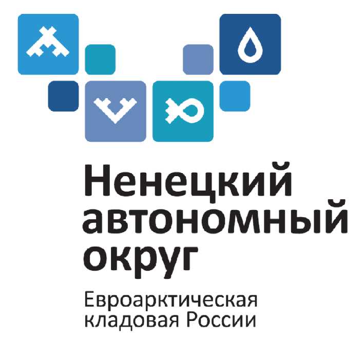
Picture 1. ''Brand NAO''
The main components of the brand represents: tent - indigenous people, the Nenets, the care of residents of the district, deer antlers and fish - the traditional sectors of the economy, a drop - oil production and water supplies. Put together, they form the Polar logo of the region - the outlines of characters resemble the cartographic image of the region: the left - the Kanin Peninsula to the right - Vaigach Island, between them - the vast tundra. Focus group participants were tested models of brand design, easy to distinguish the silhouette of a flying bird, and branched antlers, the silhouette of the district, the traditional patterns.
Of fundamental importance in testing in the focus groups was indistinguishable in the interpretation of the character test droplets. Most study participants have traditionally interpreted it as oil, but the respondents focused on the values of nature, saw it, and water resources: the most pure river of Europe - the Pechora, numerous lakes, a thousand miles of Arctic coastline.
Color marking of various shades of blue reflects the peculiarities of the territory: low temperature, water, sky, snow, northern lights. Colors - blue, white and blue are associated with the air of the North, snow, sea, rivers and lakes. The color of each square of correlates with the picture of the sign: blue sky - with the national housing icon (the people), gray - a deer antler, greenish aquamarine - fish and seafood, as a dark blue - oil.
Elements of the logo represent the kind of designer. Of these, you can put any form of a mosaic with the required information promise. On the basis of the logo was designed by a set of corporate identity in the region, which includes a set of postcards to all public holidays, personal invitation, wall calendar, envelopes, and a congratulatory address.
The project also developed a strategy to promote the region and its interaction with all the brand's main target groups. The primary audience for which the brand aims to be investors. For them, the investment was made a passport and a catalog of investment projects of the district. This information formed the basis for new investment proposals of the NAO website.
As a result of the brand book has been prepared containing a description of the concept of the brand and its platform, the guideline on the logo and corporate identity, as well as the brand development strategy.
During 2011, the work has been done to establish the communications with the "industrial investors". In the midst – the work on building relationships with people, promotion of people of the NAO as the principal heritage district. In the future – it is the development of regional branding messages to tourists and buyers of consumer products and services to county businesses.
During 2011 the authorities of the NAO, businesses and enterprising personalities of the region have used the symbolism of the NAO brand in more than 30 projects. Based on the brand's web site for investment proposals, decorated portal of the NAO - was made more than 20 kinds of souvenirs. Brand - is not only a symbol, sign, and reputation. The practice of the economic activity shows that it is a positive NAO. Official rankings and is used to assess the effectiveness of the indicators point to the leadership of the region - for investment attraction, construction of residential buildings per person.
References The brand of the Nenets Autonomous Okrug as a Euroarctic Storeroom of Russia
- Bormotov I. S. How the new brand of the Nenets autonomous region was created // Brand-management. 2011. No 5. P. 320−326.
