Types of navigation from websites and analyzing their characteristics

Author: Goran Bidjovski
Journal: International Journal of Image, Graphics and Signal Processing @ijigsp
Article in issue: 11 vol.10, 2018.
Free access
The subject of the research in this scientific paper is a description of the opportunity for navigation through the websites, with special emphasis on analyzing different types of navigation systems. The important part of my paper is analyzing the characteristics of various navigation structures on the web pages, as well as the analyzing technical methods of displaying navigation on various users' computers. In addition, users can have different browsers, different operating systems, and different preferences in terms of their computers' settings. All these technical issues will have an impact on how the web pages will look on the user's computer. Another thing described in my work is the interpretation of navigation structures on the user's computer monitor. A special overview is made for the correlation between web navigation and all the other graphic elements in the web pages from point of view of a visual harmony of the websites. Additionally, here I give overall directions for using navigation type and their characteristics when designing websites, same as the description of some opinions and advice on the same topic. After that, I analyze twelve problems which arise from displaying navigation on the websites on the user's computer. In this paper, I will come across a few solutions for all of them, as well as recommendations for when to choose which solution.
Navigation from websites, types of navigation and their characteristics, the composition of the web pages, displaying navigation on a user’s computers, web design
Short address: https://sciup.org/15016013
IDR: 15016013 | DOI: 10.5815/ijigsp.2018.11.07
Text of the scientific article Types of navigation from websites and analyzing their characteristics
Published Online November 2018 in MECS
Good web design is determined mostly by good navigation. When it's said that one site is well designed or it works well, usually is considered that it has great, intuitive navigation. Navigation is a visual expression of site structure and is the most basic problem that needs to be solved when sites are designed. Without navigation, the web would be an unconnected collection of web pages which would be troublesome to find, because web address (URL) will need to be written for every page we would like to visit.
Navigation has two basic functions: passing from one to another place and determining momentary position. Web navigation compensates for the lack of sense of space by uniting a hierarchical structure of the website and by that, creating a sense of orientation. The easy finding of every page on one website is especially important. One clear and constant by structure and type navigation system contributes to user pleasure and increases the number of pages visited by users. If navigation works well, from it will be quite easy to understand where to start and what the possibilities are. When navigation is created properly, there will be no need for other instructions.
Term permanent (global) navigation is used to describe the set of navigation elements that are met on every page of a given site. Showing of navigation in the same place on every page with constant appearance is by itself enough to suggest that user is still on the same site, which is very important. And maintaining one same appearance of navigation through all the site means that users will have to learn how it works only once.
Researches of the comfort of using show that users are not feeling comfortable on sites that are trying to use navigation interface that is radically different from navigation that dominates in other sites. Not all navigational structures are used in every type of sites. Analogically, there is dependence between a type of site and navigational structure. [1, 2]
Few useful mechanisms for navigation in current browsers are giving certain help. Back button leads the user straight to the last visited page, chronological list (History) shows last 20 visited pages (or other numbers, depending on user’s settings), hypertext links change their color if they were visited... Knowing that some connection leads to already visited page is useful because users do not waste time by visiting the same page a few times. Buttons for (Next) and (Previous) page can be used for easier reading of long texts written on a few pages. In that case, every page should contain a link for the next and/or previous page of text. Web pages of acceptable size should be stimulated, so the user doesn't have to scroll down a lot if he wants to see the whole information.
One of the most important elements of global navigation is button or hyperlink that leads to a website home page. When button or hyperlink to the home page is visible the entire time, that gives certainty that it's always possible to start from the beginning.
Current users' position should be displayed on two different levels: in relation to the web as a whole, and in relation to website structure. Navigation shows the users where they are in a general scheme. In the global network, this is combined with accenting of the current position of the user in the suitable navigation bar, list or page menu. Position depending on a site structure is usually shown: by arrow set by it, by a change in text color, by use of thickened text, by switching button colors and by changing of button color. [16]
Hyperlinks are shown in a way that is different from other parts of the document. Text that is hyperlink can be shown by switched colors between it and a background, by a different color, or it can be underlined. Pictures that serve as hyperlinks are commonly presented by colored frame (most browsers are using blue by default). The frame can be removed if it makes the web page to look unattractive. Standard graphic links can be recognized as such when the mouse pointer is above them and converts into hand pointer.
A lot of designers decide navigation elements of web pages be presented only as graphics. Use of graphic navigation elements is allowed, but it is recommended pure textual links also to exist together with graphic elements. To avoid disturbance of web page appearance, text links should be shown on the bottom of the page (Fig. 1) (Fig. 2).
-
III. Related Research
In this section are presented previously mentioned web navigation systems with analysis of their characteristics.
-
A. Navigation Bars
Every bar for navigation should contain between 5 and 7 elements, otherwise, it becomes hard to percept and orient in it. Navigation bars can be positioned horizontally and vertically. Lots of pages are using both horizontal and vertical navigation elements. [11]
-
II. Study Area
A.1. Horizontal Navigation Bars
There are many ways to design navigation system: tabs, navigation bars, icons, image maps, buttons, pop-up navigation systems, logos, breadcrumbs, drop down menus, search fields, instruments, site maps, a name of the page and other. The decision for what navigation system to be used for a specific site depends on problems that need to be solved with it.

Fig. 1 -
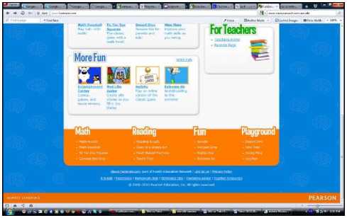
Fig. 2 -
Setting navigation links horizontally in the upper part of the page makes links directly available. This way is preferred by designers who first think of performance speed. It's more efficient with text links (Fig. 3) than with graphics links (Fig. 4). If a website has a certain number of text links in the upper part of the page, visitors can move to other pages right away, without having to wait for a prolonged load of pictures that are used as links.
Fig.3 -
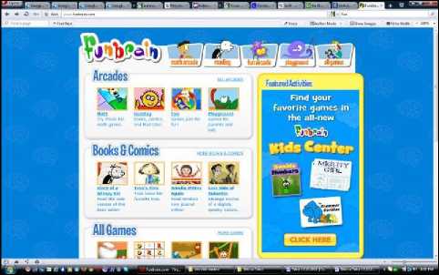
Fig. 4 -
Horizontal graphic navigation bars are used mostly in upper part of the page but can be also set in the bottom part. Navigation horizontal bar placed in the upper part is used as global navigation almost in every type of site. For some, it is the main navigation tool, and for others, it serves for global or local navigation.
A.2. Vertical Navigation Bars
By nature, vertical navigation bars create one structural grid in which links are put on the side in one compact column (Fig. 5).
This arrangement serves to make navigation links secondary, while page content stays primary. Vertical navigation bars can contain the larger number of links than horizontal bars and still stay relatively loose.
Vertical navigation bars are usually set on the left side of the page, but now a large number of sites put navigation elements on the right side of a page (Fig. 6). Navigation with left set vertical bar solves a wide range of navigation problems and because it can be broadened, when the site is expanded or when navigation needs change, the panel can easily be modified with adding links or buttons (it is expanded downwards). Left set bar offers a simple, flexible and continuous source of navigation on one website. It can explain site structure, show parts (that otherwise can be missed), to set permanent spot for site functions on all pages (like for example, search bar) and to set apart important from not that important parts.
-
B. Pop-up Windows
Pop-up windows are small windows that show together with the browser main window (Fig. 7). Pop-up windows provoke strong feelings, mostly because of the ads that usually show up in them. But they also have other use: navigation menus, additional systems, maps, calendars, messages, audio, movies, promotions, greetings, information, invitations, surveys, place to show big pictures when we click on their miniature copies etc.
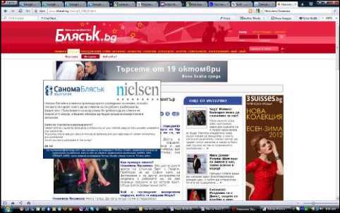
Fig. 7 -
Pop-up window elements that can be included in its window are: hyperlink bar, address bar, standard menu bar, sliding scroll bars, status bar, buttons bar with back and forward buttons included etc. (Fig. 8).
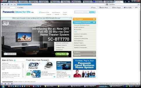
Fig. 6 -
One of the advantages of pop-up windows is that they can be extended without a need to change something else in overall design.
Some visitors don't have a good opinion for pop-up windows. In the last years, different software modules are made that block pop-up windows appearance when they are installed with the certain browser. [14]
Some special pop-up windows exist which are popping out when the user is leaving the site. Also, there is a concept "pop-under", in which case window is positioned under, and not over the current window.
C. Buttons
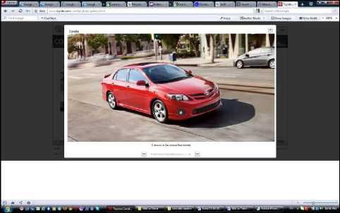
Fig. 8 -
Web buttons can have a lot of forms, from simple, flat in appearance to overcrowded three-dimensional objects that imitate pushing with downward collapse when the cursor moves over them. Buttons are composed of text (Fig. 9), graphic (Fig. 10), or (more often) combination of text and graphic (Fig. 1).
Fig. 9 -
Fig. 10 -
Web buttons can be 2 (Fig. 5), 2½ or 3 dimensional (Fig. 11) (Fig. 12). If the impression should be given together with information, it is best to use 3 dimensional interfaces.
Fig. 11 -
Fig. 12 -
Buttons are static or primitively animated (Fig. 13) (Fig. 14), who show plain blinking text or similar.
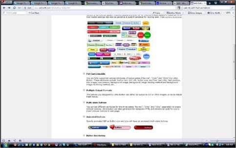
Fig. 13 -
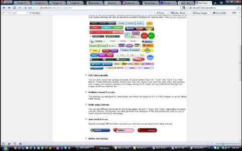
Fig. 14 -
Mostly used buttons dimensions are: 88 x 31 px; 120 x 60 px; 120 x 90 px; 125 x 125 px. [3]
The user should not waste single millisecond thinking should the button can be clicked on or not.
They don't have enough surfaces for any kind of message and mostly they just contain words like "click", "free" or the name of the site which they lead to.
All buttons from one website should be consistent, which means that they have the same dimension, color scheme etc. Also, groups of buttons on all pages need to be the same and in the same places. The only button on current page can be different, (example, it can be in darker color), by which users know where they are at that moment (Fig. 4) (Fig. 1).
Fig. 16 -
Possible positions of an active button are: the rest condition, elapse condition (which shows active spot or explanation text for button under or above it) and active condition (after the mouse button is released, the action starts). There is another possibility that sometimes is used, and that's the condition in which button at the moment is not active and can't be selected.
Interactive navigation buttons are very popular. When the mouse pointer is over the surface of one picture, it can respond by changing with another picture, or when it is clicked on with the mouse, it can change with the third picture.
Fig. 17 -
Combination of rollover picture and interactive button creates specific kind of button, so-called rollover button. [4]
User sections can be animated in different rollover states the same way pictures in a normal state can be animated. Big minus for rollover buttons is that they need twice as much data for transfer. If in one web page a lot of elements like that are used, then that is a problem.
Buttons commonly used in web design are:
-
- Reset button (for reconstruction, getting back to the original state). It allows the visitors to automatically clean forms (Fig. 15);
Fig. 18 -
-
- Submit button (secure, assign) sends information written in the form to the server. That kind of button is necessary for every form (Fig. 16);
-
- Radio buttons – a sum of options that exclude each other (Fig. 17);
-
- Check boxes - a sum of options that not exclude each other (Fig. 18);
-
- Command buttons - used for critical and/or common operations (OK, Cancel, Close, Apply, Help);
-
- Skip Intro - it's becoming necessary for sites that have the intro.
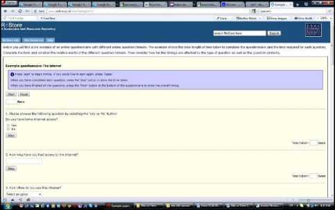
Fig. 15 -
-
D. Instruments
Instruments are hyperlinks to important components of the site that in reality are not parts of the hierarchical structure of the content. They are elements that support using the site (example: Help - information that is of assistance) or give information about authors (for example: About Us and Contact Us) (Fig. 19).
Instrument list shouldn't attract much attention.
Instruments are different at different sites. [18]
Permanent navigation shouldn't include more than four or five instruments - those that users will need most often. If more instruments are included, there is a danger that most important ones will be lost between many others.
Fig. 19 -
-
E. Breadcrumbs
Breadcrumbs show current position. Word "breadcrumbs" is used because that reminds of the path of crumbs from a well-known tale of Hansel and Gretel (German story, rewritten by Grimm brothers) (Fig. 20).
Unlike "You are here" kind of signs that show where is the user, depending on the hierarchical structure of the website, breadcrumbs show only the way from home page to the current position. First one shows where the user is in a general scheme of things, while the second one shows how to get there. For most sites, only breadcrumbs are not good enough scheme for navigation. They are not a suitable replacement that shows at least two top layers of hierarchical structure, because they don't show enough.
Breadcrumbs don't take large space and they offer the user comfortable and consistent way to do two of the things that are mostly done: to get back one level up in a hierarchical structure, or to get back on the home page. Breadcrumbs are most useful as a part of one comprehensive, well-balanced navigation. They are a valuable addition to one solid navigation scheme, especially in big sites with deep hierarchical structure, or when it is needed a few subsites to be united.
Best is if breadcrumbs are positioned on top. This type of navigation works best when it's in the upper part of the page, above everything else. This functions best because breadcrumbs are left kind of isolated from a primary content and they look like something additional. When they are put lower on the page, they start to compete with basic navigation. Divider "greater than" (>) is used between separate levels. Colon (:) and slash (/) are also used, but ">" sign is a most suitable divider because its appearance shows moving forward to lower levels. [13]
Used fonts should be small. In that way would be stressed out that we look at something additional. The last element should be thickened (or in some other way different from the other words). The last element in the line should be the name of the current page. Because it will be thickened it will be clearly noticeable, which is the rule. Breadcrumbs should not be used as a replacement for page names. There were many attempts last element in the string to have a double function, thus eliminating the need for the separate page name. Some sites tried that by making the last element in the line the biggest. At first glance, this strategy should work, but in reality, it doesn't, because it doesn't justify expectations that titles should be aligned left or centered, and not to dangle in the middle of the page on the end of the string.
Breadcrumbs are useful for hierarchical informative structures because they need embedded levels of progressively decreasing subsites. So, breadcrumbs should be used when a site contains a lot of hierarchical information that users get by following a conceptual path deeper and deeper into site structure. Paths give the user visual presentation of current position and they allow not only to be back on the home page, but to partially get back through already crossed steps and to choose another path on the way. The user, with only one click, can get back to every level.
-
F. Tabs
Tabs are one of few rare cases in which using physical metaphor in user interface really works. Similar to dividers in folders with rings and dividers in registers, they part the content in sections. Above that, they make it easier to open one particular section - it is enough to touch the divider (or in global network case, to click on the appropriate tab).
Tabs are great navigation solution for big sites. Reasons for this are:
-
- They are easily recognizable. Anyone that knows even a little bit about computers will right away understand what they serve for.
-
- They are hard to miss. Because tabs are very clearly shown, chances not to be seen are very small. And because it's hard for them to be accepted as anything else but navigation tool, they create dividing between navigation and other content clearly since the first glance.
-
- They look elegant. Web designers constantly struggle to make websites more interesting to watch. When tabs are designed well, they give more shine to sites, and at the same time, they are very useful.
-
- They create a feeling of physical vastness. Tabs create the illusion that one of them that is currently active is physically moving forward. This is a simple but effective trick which is probably based on the fact that humans can very well notice visual differences (they can look at the objects that are put before other ones).
The result is creating stronger impression than by ordinary site dividing sections and perception for presence in one of those.
Tabs should be shown properly. To maximize their use, they should be designed to create the illusion that the chosen tab is currently in front of the others. To create this illusion, the active tab should be colored by different color or contrast shade and to be physically connected with space under it. That is what it makes the active tab to "jump out" forward.
Tabs should be appropriately colored. Different color of tabs for every section of the site can be used. Other navigation elements of the page will be shown in the same color, so everything will look like parts of the same whole. Colors are a great medium for additional orientation and guidance of users, but they never should be used as the only mark.
One of the tabs needs to be active when the site is first entered on. If by entering given site no tab is chosen, their effect is lost in the first few important seconds when that is most significant.
For more elaborate sites there's a possibility to use more than one level of tabs (Fig. 21) (Fig. 22). In this, for greater transparency for each level of tabs usually different combination of colors is used for active/inactive tabs. When using more tab levels it should be stressed not to overdo their use, because with a large number of levels clarity and functionality of the site is disrupted, and that is the main reason for using tabs.
Fig. 21 -
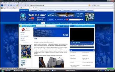
Fig. 22 -
Use of tabs allows clearer and more precise content separation on one web page. Clear navigation is a big advantage for their use. Using the right combination of colors that correspond with complete vision on the page, an opportunity is given coloration of the site to be kept, which presents one of the main assets for the quality visual design of one web page. Tabs also give an opportunity for the efficient way in which web designers can express their creativity.
-
G. Drop Down Menu
Because space on web pages is very limited, web designers always look for ways to expand it. One of the most common ways to do that is by using a drop down menu (also known as "drop-down list") (Fig. 23) (Fig. 24).
If the site is quite small, access to every part of it can be achieved with help of drop down menu. Menus can contain a list of every basic part of the site, and users can open them by clicking on the button and choosing the element from the list. Another advantage of drop down menus is that they can be expanded without a need to change anything in the entire design.
When using the drop down menu, effects for color and text should not be excessive - effective opening of menus is enough to capture user attention. In these menus, all kinds of elements can be used, like graphics, forms, and lists.
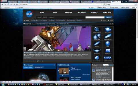
Fig. 23 -
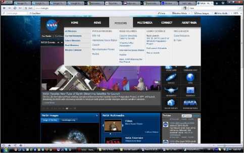
Fig. 24 -
Their use is connected with a few basic problems:
-
- It is necessary to look for them. To see the list of options, the user should click on the drop down menu. Because of this reason, there is no way drop down menu to pull user attention while the page is still being looked over.
- They are hard to inspect. When designers use a standard drop down menu, there is no way to control font, distance, and forming of the list, so they can't make it easier to read. Except that, there is no way list to be divided into sub-groups.
-
- They are too inconsistent. The fact that the list shows up and hides so quickly makes reading more difficult.
Drop down menus should be used when their content is absolutely obvious. They are usually used as part of the navigation system, and not like separate navigation. They allow the user fast and way which saves space and choose between parallel (and among each other excluding) elements. [12]
Drop down menus are most appropriate for an alphabetic list of records with steady names, like states (USA, EU...) (Fig. 25) (Fig. 26), or products because that doesn't push the user to think about it. But drop down menus are not at all so functional for lists in which user maybe doesn't know the exact name of what he is looking for. The situation becomes even more unpleasant when the list is not alphabetically made, or it is too long and there is a need to scroll down with a mouse.
Fig. 25 -
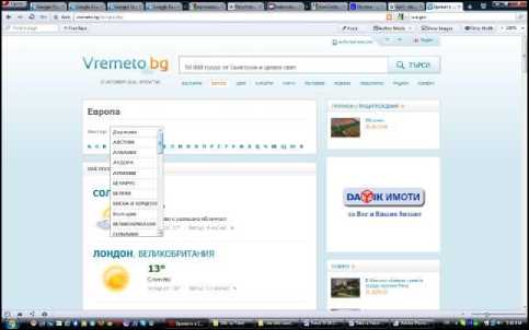
Fig. 26 -
-
H. Name of the Page
Names of pages are landmarks of the global network (Fig. 27) (Fig. 28). Same as with signs, when all functions well, these names can be totally neglected. But as soon as the user feels that the path he is on is not right, he should look at the name of the current page so to get orientation.
Adequate name of the page helps for an intuitive and impeccable finding of every web page. The name also helps browsers with direct access to the page. Sometimes it is thought that is enough to stress the name of the page in the navigation. With that, at the same time space and work in designing of the page are saved, but it doesn't change the fact that it isn't enough. Name of the page should exist too. [5]
The name should be clearly visible. Position, size, color, and font need to be chosen to clearly show that that is the title of the whole page. In most cases, that is the biggest text on the page.
It is important good names of the pages to be chosen because they are used as basic links to them. Another important thing is a name to have enough words that make sense when read from a menu or from search results. On the other hand, too long titles slow the users, so best is a name to be composed of two to six words (sometimes even name of one word can be used). [1]
Fig. 27 -
Fig. 28 -
Generally, the short title is better than a long one.
Of course, different pages need different names. Not every page name should begin with the same word, because when quickly checking the list, making difference would be difficult. General words should be put at the end of the name.
-
I. Search Function
The search function is the alternative shortcut to get to the specific content on the website. The usual way is user to follow the navigation structure in which site content is organized or hyperlinks between different elements. A quicker way to get to the specific information is through search field. In it, the name of the product or some other distinguishing parameter is written, and system as an answer gives back a list of site pages where needed words and characteristics are mentioned. The search function is a great way to help users to find information that they are interested in with a minimal number of mouse clicks.
The search function is one of the most friendly and most efficient means that one site can have. It not only helps visitors to find exactly what they are looking for but also gives priceless information. Search engine based on a server can create statistical (log) entries, which reflect a lot of search conditions. As a result, it can be seen what most of the users are searching for. [6]
It contains the word "search" that is one of two perfect ones on search button label (Fig. 27). "Go" is a second perfect word, but only if "Search" is used as field label (Fig. 29). Unless if given site is not too small or very well organized, every page should contain search field or link to search page.
While using the search function, instructions should be avoided. But if there is even smallest possibility to confuse search parameters, (where to search: on site, in one part of it or in the whole global network), that should be stressed out. It is nice to give users a possibility to limit search extent. This is useful when the search is giving too many results and it is really necessary to limit the search extent. The search function should be at least 25 characters in width, so it can accept more words without hiding parts of users search.
-
J. Site Map
The site map is a web page that shows all the pages of the certain website in a hierarchical structure (Fig. 30). That allows getting a general picture of the entire site, and also enables connection to all pages. Site map is something like an index of all basic site parts. It is an important site map to be available from any part of the site.
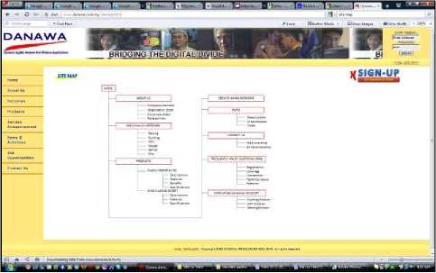
Fig. 30 -
The site map shouldn't be too "sharp-witted", filled with metaphors. The larger the website, the bigger the need for the site map. [17]
On the site map lots of boxes can be seen (this is a designer solution) (Fig. 31). Each box represents a site page, and the first one presents a home page. Group of few boxes usually means a collection of pages with the same design and similar content. Every line presents a connection or pathway between pages.
Site maps can be created (other than in graphic format) like plain text index. If for site map text index is used, AZ bar should be included in the upper part which contains links to all parts of site map alphabetically (Fig. 32). It doesn't matter if site map will have pictures or not, one understandable text card should always be present (without graphics).
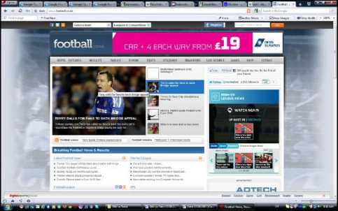
Fig. 29 -
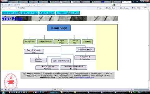
Fig. 31 -
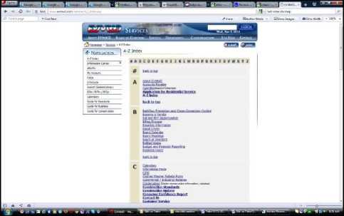
Fig. 32 -
But, most of the site maps miss one possibility that every user thinks it's important: indicator "you are here". Many sites project their site maps as simple lists of all available pages. A better solution would be one dynamic site map that marks the page through which user got in, and has a way to accent useful information for individual user groups.
Of course, site maps should be updated regularly.
-
K. Image Map
Image maps are images, in which certain areas are marked as "hot spots", and are active zones which function as hyperlinks that are used to be connected with another URL address (connections can be towards text files, other pictures, audio, video or multimedia files, other pages in the same website or in other websites). This zones can be in any kind of shape - from rectangle to oval or polygonal (Fig. 33).
Web designers often use image tables (that are similar to image map). Their basic idea is to cut the image in parts and every part to be set in the appropriate cell of an invisible table, which will allow it to look like one big image in the browser. Link can be made from every part, and also, every part of the table can be individually optimized. With them, specified parts of the larger image can be animated. [15]
In the active parts of the image map, rollover effects can also be created.
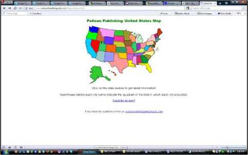
Fig. 33 -
-
L. Identification Graphics (Logo)
A logo is a graphic element or emblem, which in a certain way presents corporation, coalition, organization, product or even specific person. Logos can be completely graphic (symbols or icons), or with added text that is integrated as a part of that logo (Fig. 34). Strongly preferred method for identifying a company brand is logo setting. [7]
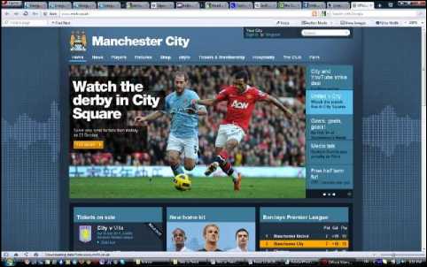
Fig. 34 -
The logo is usually put in the top left angle of the page (or at least close to it), analogically to printed corporate forms. That is on websites that are written in languages that are read from left to right. In sites that are read from right to left (Arabic, Hebrew) site logo is usually on the right (Fig. 35). Anyway, it is not enough logo on the site to be on expected place. It has to look like a site logo, which means it should possess all graphic design logo attributes. [10]
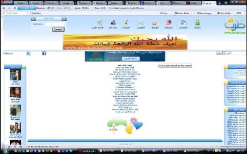
Fig. 35 -
One of the most important elements of global navigation is button or link that leads to a website home page. When button or link towards home page is visible the entire time, it gives assurance that however hopelessly user gets lost in the website, start from the beginning is always possible. Lately, the rule that the site logo serves as a button that leads to home page too is more and more used.
Logo presents the entire site, which makes it highest positioned element in the hierarchical structure. The logo should always be set in every page of the website, on the same place and with the same size. It helps visual stability to be maintained from page to page. When users surf through pages of the website, they will have a feeling of order and consistency. Logo presence on every page helps visitors to orientate immediately, right after getting into the site through page different from a home page.
M. Icons
Icons are small, decorative illustrations (Fig. 36). They are similar to dingbats but are usually used with larger dimensions and have a more complicated design. Icons can be very different from one another: from abstract and highly styled, to real and literal. Icons are often used as navigation elements.
icon - print the page, envelope - send an e-mail (Fig. 38) etc.
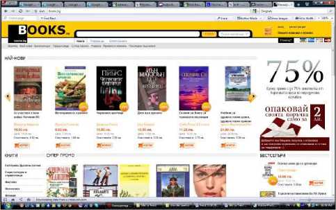
Fig. 37 -
Fig. 36 -
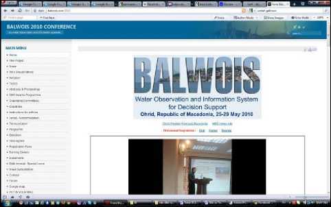
Fig. 38 -
In operating systems with graphical user interface icon is used to present different elements: files, folders, disks, peripheral devices, for sending commands to the system etc. Computer icon purpose is to symbolize certain function or program possibility. To achieve that, icon image should reflect something known and acceptable to human consciousness and create the association with an object, quality, action, result etc. [9]
Reason to use icons is that an image in them can say more than a text in a limited space. Text links to the same URL that icons lead to should also be included to increase a degree of user-friendliness. Basic settings of an icon like web design component are: appropriate scale (because of low screen resolution from one side and needed compactness from the other), contrast/readability, uniformity/identity of a picture, information (finding the optimal solution for interaction between picture and text) and style unity of all icons.
Mostly used icon dimensions are: 48 x 48 px, 32 x 32 px, 24 x 24 px and 16 x 16 px (there are icons that can be even 128 x 128 px or 512 x 512 px), so one icon should be elaborated in more than one size. [8]
Some icons turned into web design standard. One of them is the icon "add to cart" (Fig. 37). Shopping cart (add to cart) is usually set in upper right angle. Shopping carts can be seen in many e-commerce sites. Other popular icons are: question mark - means help, printer
Icons can also be composed of moving pictures (animations). Some kinds of information are more easily presented through movable instead of static pictures. Animation gives great opportunity to illustrate any kind of changeable operation. The icon should present the animation when the user is interested in it (for example, if the mouse pointer is held over it for more than a second).
-
IV. Findings/Results
In this part of the scientific paper are twelve problems that arise from the displaying of navigation from websites on users computers and their characteristics are analyzed. There are a few solutions to the problems, as well as recommendations which decision when to be made.
-
A. Problems with Visibility of Horizontal Navigation Bars
Defect when using horizontal navigation bar in the upper part of the page is that it gets quickly lost out of sight when the page is scrolled down. Because of this, it is a good idea to insert a second horizontal navigation bar in the bottom part of the page. It is usual to have a pleasant graphic navigation bar in the upper part of the page and a second one, more formal navigation bar at the bottom of the page. Usually, the second navigation bar is textual, with small font, but that is not obligatory (Fig. 1) (Fig. 2).
-
B. Problems with Visibility of Vertical Navigation Bars
Vertical navigation links can quickly get out of site when pages are long. With them too is a good idea to set the second set of horizontal navigation links on the bottom of the page (text links) (Fig. 6) (Fig. 39). In that way, visitors don't have to scroll the page up to be able to move to some other page.
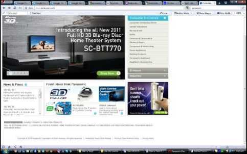
Fig. 39 -
-
C. Problems with Different Navigation on Pages that Contain Filling Forms and All the Other Pages in One Site
One of the main rules with accommodating navigation in all pages on one website is that it always has to be equal. The exception of this rule can be made only with filling forms (Fig. 40) (Fig. 41).
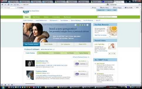
Fig. 40 -
On the pages that contain filling forms, consistent navigation sometimes can unnecessarily be a reason for scattering. It is best this kind of pages to contain shorten version of consistent navigation including the only sign or site logo that presents hyperlink towards home page and all kinds of useful tools that help while filling the form.
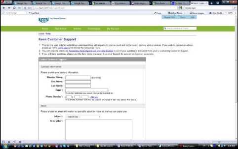
Fig. 41 -
-
D. Advantages and Deficiencies of Graphic and Textual Navigation
Navigation that contains graphics, same as textual navigation have their advantages, but also deficiencies. Graphic hyperlinks have the important advantage before textual ones: any font can be used, any size of the font, color on button text and effects can be used when mouse pointer goes over them (for example, color can be changed). So, graphic hyperlinks offer a lot more flexible design options than textual ones. The main disadvantage is that a lot of time is needed for them to be made. First, buttons should be created - with graphics program which making consumes time. Then the page should be programmed (for example, with JavaScript which is also relatively difficult). So, this is not a method that can be used always and anywhere.
Text navigation is a lot smaller in size, which means it will be loaded more quickly, and that is very important (Fig. 42). But textual hyperlinks don't support rollover effect. That is why they solve the problem by rendering text as a picture and then put another color, brightness or other effects over rollover picture.
Fig. 42 -
-
E. Problems with Possibility to Display Pictures in
Navigation
When a website is projected and created, should be considered how it looks when pictures are available or unavailable. Because of different reasons, some users can't see the pictures, and with that, also graphic navigation. To make these users able to move through the website, ALT tags should be engaged, which allows text explanation to be shown for each picture that is not seen.
Also, purely textual navigation need to be given as reciprocal to those based on graphics (Fig. 1) (Fig. 2). If there is a possibility, it is nice to create a purely textual version of the site.
-
F. Problems with Different Behaviors in Different Regimes of Pop-up Windows
Pop-up windows have different behaviors depending on what regime is a window in when it's used. For example, the pop-up window is used that allows the visitor to enter information into the form, which later is used to update information in the main window. It is possible that visitor won't enter information in the pop-up window, window to stay open, and/or visitor gets back to the starting page. The system expects information that may never be given. The visitor can make other changes and get back into the pop-up window, enter the information and with that completely confuse the system.
In that case, to avoid these problems, in the tag, a code should be added that makes a window to close when the visitor leaves it. That window can always be opened again from the main page, but it can't be directly reached.
-
G. Problems with Guidance of Where Contents from Chosen Links to be Open
Problem with hypertext surrounding is in a possibility that when the user clicks on some interesting link on a certain page to not be able to get back.
One solution to this problem is showing the wanted page in a new window. This way also the first page stays open in the background. But this technique also has negative characteristics too. For a large part of the users, losing control over what they are looking at is irritating. The user may even not notice that a new window is open in front of the current one if the browser fills up the entire screen.
Value can be added to every link from the page that will provoke content to open in a new window. But that will only contribute to the total confusion of the user.
The better method, especially if there is more than one link is to place a name to the target window, which will be used again by next links. So, all targeted documents will open in the same second window. First (starting) and second (target) window in which content will change depending what link the user clicks on, will always be open.
-
H. Problems with Name Length of the Page
When creating a link to the certain page, a name of the page should correspond with the term on which user clicks on. This is not a rule, but it's a standard name of the page to correspond with the words that need to be clicked on to get there. Of course, sometimes is necessary to compromise, usually because of the limited space. If the name of the page is composed of several words, then exception from the rule can be made. Then, as an alternative solution one or two words can be taken from the name of the page, maybe some abbreviation or word which clearly defines what is meant by it.
Another option is words to be as close as possible by meaning and a reason for in compliance to be obvious.
-
I. Problems with the Frame of Active Connection (Link) on Pictures
Pictures can also be used as a link. With them, the problem is the frame that shows around pictures. Frames of active connection on pictures are contours that show around the link after it was clicked on. They can ruin page design and color composition. To remove these frames, a code should be put in links in which frames should be turned off during their active state.
In the past, there was an unwritten rule every picturelink to have colored frame around it. That leads to knowledge that certain picture is a link. From a functional aspect, this rule is very good. But with it, design composition of the page is disrupted. That means that from the aesthetics aspect this solution is not good. By internet development and creation of a large number of websites, designer's aspect is more and more important, so today this rule for putting a colored frame around picture-links is almost never used.
-
J. Problems with Unawareness that Site Logo Also Serves as a Link that Leads to Home Page
More and more, the unwritten rule is used logo of the website to serve also like a button that leads to the home page. This is a useful idea that is good to be accepted by every site. That way, site navigation will be much relieved, because users can always go to the home page and start all over. But a surprising number of users don’t know about this rule. To improve that, word "Home" (home page) should be discreetly added to the logo on every page on the site. In this way, users will know they can click on the logo. Until this unwritten rule becomes known all around, there should be a link toward home page in sections and/or instruments (Fig. 34).
-
K. Problems with the Accessibility of Every Page from one Website
Website structure should allow every page to be available from more pages. Access limitations can make finding important things on the site difficult. When website structure is designed it should be allowed a few pathways to every page to exist. Also, by eventual adding of site map, all pages will be marked and accessible through there (Fig. 30) (Fig. 31) (Fig. 32).
-
L. Problems with Hierarchical Organization Manner of Pages on a Website
When information is organized in web, there is always a tension between the wish to present many options on the surface so that visitors don't dig too much (shallow site - the good point here is that with few clicks every page can be reached, and a bad point is a large number of pages on every level that definitely makes the user think because of the complexity of choices) and wish to give the visitors beginning/start when important things are in focus, which gives some information a priority, so specific subjects are put in layers under main categories (deep site - here pages of one level are few and choice is easy, but bad thing is a larger number of needed clicks to get to the wanted information).
One of the most commonly used phrases while surfing through websites is navigation with three clicks. The idea is taken into consideration that all parts of a given website should be reached by three mouse clicks, no matter where the user is at that moment. That is very easily achieved with help of navigation bars and site map. If navigation bar that contains a link to the site map and it's visible on all site pages is created, the user will always be one click away from the site map, and then another click from all site parts. In that way, in many cases is possible to achieve the navigation system even with two instead of three clicks.
As a conclusion should be said that is good, if possible, a hierarchical scheme of a site to be made that is more short and wide than tight and deep. The closer the most important content is to the beginning, the easier will be to find it and will be logged and indexed by browsers with bigger certainty.
-
V. Conclusions
From the above mentioned it can be concluded that this area is extensive and offers many opportunities for research and analysis. Due to a large number of problems which occur in this area, usually, there is not only one correct solution.
For choosing the most appropriate solution, a lot of data should be collected for desires and habits of potential users, as well as the technical features of their computers. Based on those information's, the solution needs to be found. Sometimes, depending on the situation, it is possible to apply a combination of multiple solutions simultaneously.
Modern websites design allows designers themselves to decide if and when will they use standard rules for navigation of web pages, of course, together with all the other standards and norms that exist when we want to shape one stylishly designed web page.
Web designers must correspond with market needs and business expectations of site owner if they wish to create visually perfect site implementing all their ideas and imaginations in which navigation usually is one of the main things. The other segment of this problematic is users and their needs and requirements from using the Internet. And last are technical parameters and limitations that very often can represent a key factor in the decision if and which website should be visited and used. Today, when there are millions of sites with the same or similar topics, the downloading time is one of the main parameters when choosing which website to visit.
All these aspects should be considered when deciding which solution to choose to resolve these problems.
The conclusion is that in displaying navigation from websites on user’s computers, there is no universal solution for all the possible problematic situations. It should also be noted that the abundance of a variety of program languages and codes allows other solutions too, depending on the used languages and codes.
This subject, as well as everything else on web design, is very progressive. There are various new innovations and opportunities which will undoubtedly produce some other possible solutions to the problems in this science area.
References Types of navigation from websites and analyzing their characteristics
- Nielsen Jakob; "Designing Web Usability: The Practice of Simplicity"; New Riders, USA, 2000.
- Atanasov Aleksandar Petkov; "Informative and Compositional Semantic Foundations of Web Design", PhD, in "Ergonomics and design", Bulgaria, 2008.
- Toms Justine; "Internet Advertising, Mission-Possible"; Ciela Soft and Publishing Corp., Bulgaria, 2005.
- Adobe Creative Team; "Adobe Photoshop 6.0 Classroom in a Book", Adobe Press, USA, 2000.
- Krug Steve; "Don’t Make me Think: A Common Sense Approach to Web Usability, 2nd edition"; New Riders, USA, 2006.
- Gray Daniel; "Looking Good on the Web"; Coriolis Group LLC., USA, 1999.
- Airey David; "Logo Design Love: A Guide to Creating Iconic Brand Identities"; New Riders, USA, 2010.
- Vasileva Svetla, Sofia Angelova; "Lectures Software Ergonomics"; Publishing Technical University - Sofia, Bulgaria, 2009.
- Wiedemann Ed. Julius; "Taschen’s 1000 Favorite Websites"; Taschen, Germany, 2002.
- McWade John; "Before and After Graphics for Business"; Peachpit Press, USA, 2005.
- Toms Justine, Belogusheva Gorica; "Web Site, the Mission Obligatory"; Ciela Soft and Publishing Corp., Bulgaria, 2009.
- Georgieva Boryana; "Theoretical Aspects of Application of Engineering Value Analysis to Evaluation of Design Products"; 8th International Congress "Machines, Technolоgies, Materials", 18–21.09.2011, Varna, Bulgaria, year V, issue 8/2011, рр. 14-17, ISSN 1313-0226
- Stauffer Todd; "Absolute Beginner’s Guide to Creating Web Pages"; Que Publishing, USA, 2002.
- Zeldman Jeffrey; "Designing with Web Standards"; New Riders, USA, 2003.
- Bouweraerts Daniel; "Introduction to Computer Graphics Design Professional"; Course Technology, USA, 2005.
- Wiedemann Ed. Julius; "Web Design: Navigation"; Taschen, Germany, 2009.
- Karbo Michael B.; "HTML"; Forlaget Libris, Denmark, 2001.
- Willard Wendy; "HTML: A Beginner’s Guide"; The McGraw-Hill Companies, USA, 2001.
