The Evaluation of the Academic Progress Information System SIsKA-NG Mobile Based on Heuristic and User Experience

Author: I. Made Subrata Sandhiyasa, I. Gede Aris Gunadi, Gede Indrawan
Journal: International Journal of Modern Education and Computer Science @ijmecs
Article in issue: 2 vol.14, 2022.
Free access
The limitations on the Academic Progress Information System (SIsKA) application, in terms of its interface and functionality, have a direct consequence on the quality of service and monitoring student progress in the Computer Science Department of Universitas Pendidikan Ganesha. Therefore, it is necessary to overcome these limitations through research that focuses on the development and evaluation of the next generation of SIsKA (SIsKA-NG) mobile application with real-time notification advantage compared to its counterpart existing web application. The heuristic evaluation of the first stage of this mobile application development identified twenty problems where eight problems with the highest severity (Catastrophic), six problems with high priority (Major), three problems with low priority (Minor) that need to be solved, and three problems that do not need to be fixed unless there is extra time. User satisfaction was measured by using the System Usability Scale (SUS) questionnaire and gave the final score of 82.25. That score was higher than the minimal SUS standard score of 68.00 and was graded as very good, which means that users are very satisfied with using the application. To maximize more of the SIsKA-NG mobile performance, usability testing was conducted to obtain qualitative data from the same SUS respondents by using the Concurrent Think Aloud (CTA) method. CTA gave a summary result of twenty-one criticisms or suggestions that were referred to by the second stage of the SIsKA-NG mobile development.
Evaluation, concurrent think aloud, heuristic, mobile application, system usability scale, user experience
Short address: https://sciup.org/15018377
IDR: 15018377 | DOI: 10.5815/ijmecs.2022.02.05
Text of the scientific article The Evaluation of the Academic Progress Information System SIsKA-NG Mobile Based on Heuristic and User Experience
This research focused on the interface and functionality development and evaluation of the SIsKA-NG mobile application (referred next as the SIsKA-NG mobile), involving the evaluator and user directly. SIsKA-NG mobile was intended for the fast delivery of information, related to monitoring and providing material for the evaluation of student academic progress. One of the monitoring data is the thesis progress status, including proposal examination, pre-thesis examination, or thesis examination. The postgraduate program of Computer Science of Universitas Pendidikan Ganesha (Undiksha) has developed this kind of academic progress information system, which was called SIsKA. It is the abbreviation in the Indonesian language from “Sistem Informasi Kemajuan Akademik”. Initially, it is a web-based application and then complemented by its Android-based mobile application, to transform into the next generation of SIsKA (SIsKA-NG). SIsKA-NG provided real-time information related to its business processes. Also, it can add more value to the Computer Science postgraduate program for the use of the information system in daily-basis management [1,2,3].
During the development, several problems were found in the SIsKA-NG mobile, related to the interface and functionality aspect, that impacting user inconvenience. The heuristic evaluation was used to test the user interface and functionality to be accepted in general. Heuristic evaluation, which uses the Nielsen principle, proved itself as a quick and easy method of finding usability problems [4,5]. Several evaluators involved in evaluating user interface based on certain predetermined scenarios. They identified difficulties that were encountered by users while using the SIsKA-NG mobile and evaluated all of the user interfaces by specified standards.
In addition to evaluating the SIsKA-NG mobile user interface with the involvement of the evaluator, a user satisfaction questionnaire was also conducted after using the application. It is carried out by using the System Usability
Scale (SUS) questionnaire. A questionnaire is a technique that measures the level of user satisfaction in a quantitative result. SUS questionnaire is very popular [6,7] and has been widely used to determine the usefulness of the application [8] on mobile phones and tablets using the iOS and Android platforms [9]. The results of the SUS questionnaire is very easy to understand [10] even by the common people [11].
To further improve effectiveness in the development and evaluation of the SIsKA-NG mobile, this research also used the Concurrent Think Aloud (CTA) method in addition to the SUS method. By using CTA, a researcher verbalizes the user's thoughts during processing the given task scenarios [12]. CTA attracts practitioners for several reasons, such as its benefit in providing insight into user action and intention. It also has the ability for user real-time recording during the testing process [13]. At the same time, Think Aloud provides tangible benefits in providing a complete user interface [14]. A survey shows that 98% of professional usability testings have used CTA and 89% rate it as the most frequently used approach [15]. User verbalization allows the observer to interpret the problematic part of the interface [16]. At the time the user performs verbalization, all comments are recorded, so that everything the user thinks about can be captured and important points are not missed during the analysis process [17].
The contribution of this research lies in how to develop SIsKA-NG mobile as part of the academy progress information system, which is supported and strengthened by expert perspectives and refined by users directly using a questionnaire to determine the level of user satisfaction and get criticism or suggestions.
This paper was organized into several sections, i.e.: Section I described the problem background related to the SIsKA-NG mobile as part of the academy progress information system; Section II described the related works in this research area; Section III contained state-of-the-art of the developed SIsKA-NG mobile; Section IV covered the analysis of the testing result; and finally, Section V consisted of some important conclusion and future work points.
2. Related Works
This work is the continuation of the previous research that evaluated the SIsKA-NG web application by using heuristic evaluation, Retrospective Think Aloud (RTA), and User Experience Questionnaire (UEQ). That previous research gave a better UEQ result of the SIsKA-NG web compared to the UEQ result of the previous SIsKA web on four aspects, namely attractiveness, efficiency, dependability, and novelty [18].
Mustikaningtyas et al. [19], conducted the Heuristic Evaluation (HE) on the usability analysis on the Brawijaya University website. By using HE, there are 53 usability problems found by the evaluators (expert), i.e. four problems at the improvement level of high priority (major) at H1, H2, H6, H7; five problems at the improvement level of low priority (minor) at H4, H5, H8, H9, and H10; and no usability problem at H3 [19].
Almarashdeh et al. [5] show that there are benefits to using mobile applications in the government sector. The research aims to improve the design and performance of the government mobile application before they are released to end-users. Therefore, expert review evaluation is a good method for investigating the usability problems at the early stages of software implementation. Also, an evaluation of user satisfaction is still needed to ensure the success of mobile governance.
Yilmaz et al. [20] concluded on the HE on a hand-writing learning mobile application that the application does not meet the requirements. Four problems were considered at a severe level, including interface design, mobile learning content for children, error prevention, assistance, and documentation. Therefore, these problems should be addressed primarily to the effectiveness of the application. In this study, the evaluator gender does not have any influence on the usability problem detection [20].
Borovina et al. [21] concluded on the HE on mobile services web portal usability that the use of HE can produce some procedural and product improvement. after the usefulness evaluation of the integrated design [21].
The conclusion from those previous researches is that HE is proven to be effective in finding the problems at the interface of an application, regardless of the expert gender. However, direct user involvement is still required to maximize application performance
3. Research Method
The object of this research is the initial version of the Android-based SIsKA-NG mobile with three user permissions, namely study-program manager, student, and lecturer. The research method (Fig. 1) consists of several stages, namely problem identification, literature review, data collection, data analysis, recommendations, and development. The problem identification stage includes the application interface and functionality. The literature review includes the methods used in this research, i.e. the HE, SUS, and CTA.
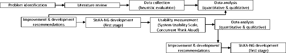
Fig. 1. Research Methodology
The evaluation process was carried out by five evaluators with academic backgrounds using the HE based on Nielsen’s Ten Heuristic model. The model consists of five measurement aspects, namely the learnability, efficiency, memorability, error, and satisfaction. Qualitative and quantitative data were obtained from this evaluation. The qualitative data are in the form of recommendations from the evaluator that will be used as a reference for the SIsKANG mobile development. The quantitative data are in the form of severity rating as a priority indicator related to which usability problems are resolved first. The rating is in the range from 0 to 5 represents meaning from disagreeing that this is a usability problem at all, cosmetic, minor, major, and catastrophic [22].
From the HE result of the first stage of development, user satisfaction is then measured by using the SUS questionnaire that involved 10 respondents [23] from the Computer Science graduate students, Undiksha. The questionnaire consists of ten items which are divided into two sub-categories namely usability and learnability. Usability is in points 1, 2, 3, 5, 6, 7, 8, and 9, while learnability is in points 4 and 10. Odd numbers are for a positive point, while even numbers for a negative point [24]. The Indonesian version of SUS was used to make it easier for respondents to understand [25].
By using the same respondents, a measurement of user satisfaction was carried out which aims to obtain responses in the form of criticisms or suggestions using CTA. Suggestions from respondents will be used as a reference for the second stage of development to further improve the SIsKA-NG mobile performance.
4. Result and Analysis 4.1 System Analysis
Based on the evaluation by five evaluators, 58 problems related to the ten principles of heuristic were found. A summary of the problems was processed to eliminate duplication of those problems. Then, the average value of severity rating was given to each of them. The summary of the problems is listed in Table 1, while its recapitulation is listed in Table 2.
Table 1. Heuristic Evaluation Result
|
Item |
Evaluator |
Problems |
SR |
|
1 |
Ev1 Ev2 Ev3 Ev4 Ev5 |
There is no process indicator when the application is performing a certain process. |
4 |
|
2 |
Ev1 Ev3 Ev4 |
The use of capital letters has not correct yet. |
4 |
|
Ev2 |
The use of language has not consistent yet, whether using Indonesian or English. |
2 |
|
|
Ev1 Ev2 |
The user should still be logged in if they haven't logged out even though the application is closed. |
4 |
|
|
3 |
Ev1 Ev2 Ev3 Ev4 Ev5 |
There is still no menu for changing the user's data, such as a profile photo, username, and password |
3.4 |
|
4 |
Ev1 Ev2 Ev3 Ev4 Ev5 |
The interface of an Android-based application has not been reflected yet. It should be adjusted using mobile standard components so that its differences can be seen compared to its web-based application. |
4 |
|
5 |
Ev1 Ev2 Ev3 Ev4 Ev5 |
There is no confirmation to perform certain processes that affect the data or risky processes, like uploading files. |
3.2 |
|
6 |
Ev1 Ev2 |
There is no icon difference for proposal, pre-thesis, and thesis menu. The icon size is also too large. |
2 |
|
Ev3 Ev4 Ev5 |
Interface components are hard to understand. It should use the interface of mobile applications. |
3 |
|
|
Ev2 Ev3 Ev4 Ev5 |
Less efficiency due to the user must log in repeatedly when the application is closed even though the user does not log out. |
4 |
|
|
7 |
Ev2 Ev5 |
The examination registration is not very suitable processed on the mobile application since the required files to be uploaded need to be transferred in advance to the smartphone. |
3.5 |
|
Ev5 |
There is no menu announcement etc related to the academic information. |
4 |
|
|
Ev3 |
There is no menu for user registration. User needs to register on the web application and once approved, use the account to log in on the mobile application. |
4 |
|
|
Ev1 |
There is no difference in icon color for the active or inactive menu. It is quite confusing to the user. |
4 |
|
|
8 |
On the sidebar menu, moving to the next menu will close the previous one. The user must open again that menu or choose back. |
4 |
|
|
Ev2 Ev3 Ev4 Ev5 |
The color combination of the application relatively dark so it is less convenient to see. |
2.5 |
|
|
9 |
Ev1 Ev3 Ev4 Ev5 |
There is no error message if an error occurs due to no Internet connection. |
3 |
|
Ev2 |
Error message when downloading files is difficult to understand because it still uses the term in application development language. |
3 |
|
|
10 |
Ev3 Ev4 Ev3 |
There is no manual book of the application or information that describes the function of each menu. |
1 |
|
Ev2 |
There is no history menu related to the student research, either in the form of a timeline or dashboard. |
1 |
Table 2. Recapitulation of the Problems Summary
|
# |
Nielsen’s Heuristic Principal |
Problems |
|
1 |
Visibility of system status |
1 |
|
2 |
Match between system and the real world |
2 |
|
3 |
User control and freedom |
2 |
|
4 |
Consistency and standards |
1 |
|
5 |
Error prevention |
1 |
|
6 |
Recognition rather than recall |
2 |
|
7 |
Flexibility and efficiency of use |
4 |
|
8 |
Aesthetic and minimalist design |
3 |
|
9 |
Help users recognize, diagnose, and recover from errors |
2 |
|
10 |
Help and documentation |
2 |
|
TOTAL |
20 |
Based on the twenty problems that have been summarized (Table 2), consolidation with the evaluators has been conducted to verify the problems and the recommendations. The result of that consolidation was used as a guideline for the SIsKA-NG mobile development to improve its performance both in terms of the interface and the functionality.
Fig. 2 shows the frequency of severity rating found by the evaluator. A total of eight problems with the highest severity (Catastrophic) must be fixed before the release of the application since they impact the user convenience or functionality. Fig. 2 also shows six problems with high priority (Major) and three problems with low priority (Minor) which both of those problems category need to be solved. There are also three problems that do not need to be fixed unless there is extra time. This severity rating was used as a reference for the SIsKA-NG mobile development, where the problems with the highest severity rating were taken care of first.
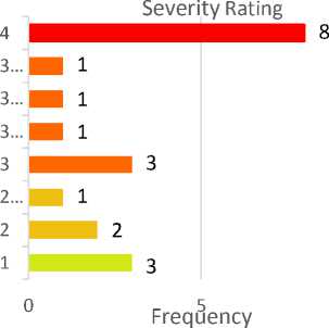
Fig. 2. Frequency of severity rating on SIsKA-NG mobile
After the first stage of development which refers to the suggestions of the evaluator and the severity rating of each problem, the measurement of user satisfaction was then carried out using the SUS questionnaire. This questionnaire involved ten respondents from Computer Science graduate students of Undiksha which were randomly selected. Table 3 shows the score for each of the questions in the SUS questionnaire.
Table 3. Final Score of System Usability Scale
|
Respondent Code |
Odd-Numbered Questions Score |
Total Score of Even-Numbered Question |
SUS Score |
|
R01 |
16 |
16 |
80 |
|
R02 |
17 |
16 |
82.5 |
|
R03 |
16 |
12 |
70 |
|
R04 |
20 |
16 |
90 |
|
R05 |
17 |
17 |
85 |
|
R06 |
18 |
18 |
90 |
|
R07 |
16 |
16 |
80 |
|
R08 |
20 |
13 |
82.5 |
|
R09 |
17 |
16 |
82.5 |
|
R10 |
16 |
16 |
80 |
|
SUS FINAL SCORE |
82,25 |
||
The final score obtained is 82.25, which means it is higher than the minimum standard score of 68.00. Grade 'A' was obtained represents that the respondents are very satisfied in using the SIsKA-NG mobile (first stage development). To improve the performance more, SIsKA-NG mobile needs to be tested for usability by involving the user directly. Usability testing was done using the CTA method. The data obtained from the same SUS respondents is in the form of suggestions/criticisms and they were used as a reference for the final stage of SIsKA-NG mobile development. Table 4 shows those comments/suggestions that have been summarized to eliminate duplicate data.
Tabel 4. Recapitulation of Criticisms/Suggestions Summary
|
Respondent Code |
Criticism/Suggestions |
|
R01, R08 |
The content of menu news and detail news should be tidied up. On those menus, there is still an error which is HTML code still visible |
|
R01, R10, R07 |
In the news menu, there is no need to display an icon that represents important news or not so important because it confuses the users. |
|
R01, R06 |
The schedule menu should use a different icon for the supervisor and the examiner. |
|
R01, R02, R03 |
The research menu should display the active research only. |
|
R01, R02, R03, R05, R06, R09, R10 |
In the detail notification menu, there is no need to display a notification receiver and notification sent status. It is better to replace them with a delete button. |
|
R01, R04 |
In the registration approval menu, it should be given a certain direction sign to find the command button. |
|
R02, R09 |
The schedule menu should use a 24-hour time format. |
|
R07, R09, R10 |
In the research menu, the number on the calendar icon is confusing, whether it is a year of the start of the research or a year of the start of the study. |
|
R02, R08 |
In the setting menu, the minimum number of characters of the account password should be determined. Recently, a character for the password was accepted which is not good. |
|
R03, R05, R07 |
In the detail news menu, the headline font size is too small compared to its content font size. |
|
R03, R08 |
The search feature on all of the pages should display all the data in opposite to display no data on the case there is no search input. |
|
R03, R10 |
Sorting data on the schedule menu should be in descending order. |
|
R03 |
If the student has not taken the research yet, its timeline should still appear with no-pass status on all of the existing stages. |
|
R04 |
In the news menu, there are news headlines that were truncated. It should be displayed un-truncated. |
|
R04, |
In the study period menu, students’ phone numbers and email should be displayed so that they can be contacted. |
|
R04, R08 |
The term start and end of the study on the profile page should be replaced with a more appropriate term. |
|
R05 |
The color of the study period label is too sharp. |
|
R05 |
The account setting menu should display the existing pictures/photo |
|
R05, R07, R10 |
In the profile setting menu, a feature to change the phone number should be added. |
|
R06, R09 |
The study period menu should display student research stage/timeline |
|
R07 |
The schedule menu should display the active schedule only |
Related to the additional features, most of the respondents suggest adding a feature to remove the notification in the notification detail page, adding a phone number and photo in the profile setting page, and adding a phone number and e-mail on the study period page.
Related to the improvement of the features, respondents suggest on SIsKA-NG mobile icons, i.e. 1) Save icon on the News page should be eliminated because the meaning of that icon confuses users; 2) The icon for the supervisor and the examiner on the Schedule page should be differentiated; 3) The calendar icon on the research page should be clearer because it confuses users.
There are also suggestions for data filtering, i.e. 1) Research data should display the active and completed research only; 2) Schedule page should display on-going schedules; 3) Data sorting should display the most recent data on top (descending order mode).
-
4.2 System Design
-
4.3 System Implementation
Fig. 3 shows the application design where the SIsKA-NG mobile uses the API model as a content provider and very suitable for applications that are running on mobile devices, such as smartphones and tablets. Data is sent to the client using JSON format to make it easier to understand by human and friendly to the CPU [26]. SIsKA-NG mobile uses a server-side backend powered by PHP with CodeIgniter 3.0 framework. To send notification quickly to the users, a third-party real-time messaging service namely Firebase Cloud Messaging was used. Notifications sent include the latest news, examination schedule, study period, and new account registration.
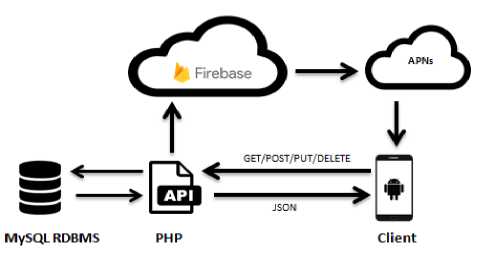
Fig. 3. SIsKA-NG mobile design
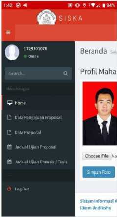
The implementation is presented with the interface result from the HE and CTA. Moreover, this section also compares the previous version of the SIsKA mobile and SIsKA-NG mobile. The design pattern in Fig. 3 was implemented in a programming language that supports a cross-platform framework using flutter. Flutter is an opensource SDK to create high-performance mobile applications supported by the ARM native code that allows developers to target two platforms at once, i.e. Android and IOS [27].
Fig. 4 shows a comparison between the previous versions of SIsKA mobile (Fig. 4a) that still use the web interface (web-view), and SIsKA-NG mobile (Fig. 4b) that has already used the mobile interface. This interface problem is one of the eight problems with the highest severity rating (Catastrophic) were found by the evaluators (Table 1), so the problem should be addressed with the highest priority. This implementation also uses menu design with the Bottom Navigation Bar model to maximize the on-screen display on the client device.
(a)
Fig. 4. User profile page: a) SIsKA mobile; b) SIsKA-NG mobile
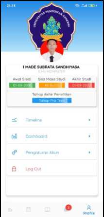
(b)
To deliver information quickly to the user, SIsKA-NG mobile is equipped with a real-time notification feature that displays the notification on the front page of the user's device (Fig. 5a). The notification can contain the message, the examination schedule, and the study-period remainder. There is also a notification management page that allows users to remove the notification (Fig. 5b) based on the CTA suggestion (Table 3). The problem getting a severity rating of 3 (Major) that should be addressed with a high priority.
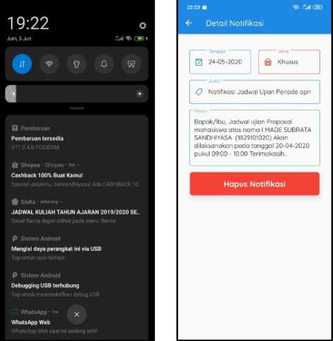
(a)
(b)
Fig. 5. User notification: a) without open the app; b) in detail.
Fig. 6 shows the research timeline menu exits on each of the student accounts. This menu will appear first when they log into the application and show the stages that must be passed related to their research, including proposal submission, proposal examination, pre-thesis examination, and thesis examination. The research timeline menu was based on the advice of the evaluators in HE (Table 1) and the user in CTA (Table 4).
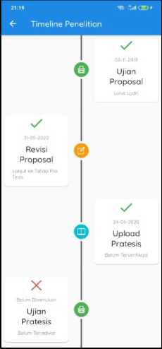
Fig. 6. Student’s research timeline
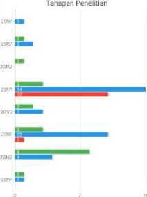
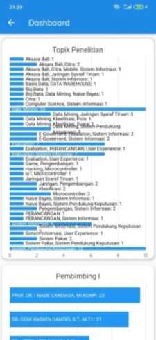
Fig. 7 shows the SIsKA-NG mobile dashboard page that displays data in graphical form. The whole perspective can be displayed on this page and can be a consideration in making decision by the management.
21 ЯО » 1н< СВ? #
<г Dashboard
■ Proposal ■ Pratesis ■ Tests
Topik Penelitian i^™ Aksara Ball 1
^^™ Aksam Bail Citra. Mobile, Sistem Informess 1
■■I Aksara Balu Jaringan Syaral Tinian: 1
■■ Aksara Ball Salem Informasi: I l^e Basis Data, DATA WAREHOUSE: 1
■■ Вч Data: 1
■^M Big Data, Data Mining, Naive Bayes: 1
^^™ Computer Science. S»Stem Informasi: 1
(b)
^ata^inin^JanryanS^arafTiruan,_S_
(a)
Fig. 7. Dashboard page
The graphs displayed on the dashboard includes data on the number of students, the number of researches per student batch, the number of each stage of research per student batch, the number of research topic, the number of research student per supervisor, etc.
5. Conclusion
The evaluation result of the academic progress information system SIsKA-NG Mobile using heuristic evaluation (HE) has found problems in two aspects, namely the interface and functionality. The most concerning aspect of the interface by the evaluators was that the application still uses a web-view interface that does not reflect the characteristics of the mobile application. Comprehensive development was required for all of the application menus. Concern from the aspect of functionality is that there is no feature of notification and study period. Also, the most common problems are flexibility and efficiency of use on four problems, and aesthetic and minimalist design on three problems.
Based on the System Usability Scale (SUS) questionnaire given to the ten respondents after development that refers to the HE, the final score of 82.25 was obtained, which is higher than the minimum standards SUS of 68.00. That score represents a very good grade which means users are very satisfied using the application.
Usability testing is carried out by the same SUS respondents. The goal is to find qualitative data in the form of criticisms or suggestions that will be used as a reference for rebuilding the SIsKA-NG mobile. Twenty-one suggestions were obtained from respondents to further improve the performance of the SIsKA-NG mobile.
A combination of the three methods that involve experts and users directly, provide significant problem finding and provide useful recommendations for improving the application performance.
Acknowledgment
This work was supported by the Indonesian Ministry of Education and Culture through the Research Grant PTM No. 107/UN48.16/LT/2020.
References The Evaluation of the Academic Progress Information System SIsKA-NG Mobile Based on Heuristic and User Experience
- A. A. I. I. Paramitha, G. R. Dantes, and G. Indrawan, “The evaluation of web based academic progress information system using heuristic evaluation and user experience questionnaire (UEQ),” in Proceedings of the 3rd International Conference on Informatics and Computing, ICIC 2018, 2018, doi: 10.1109/IAC.2018.8780430.
- G. Indrawan et al., “SIsKA: Mobile Based Academic Progress Information System,” 2017, doi: 10.2991/icirad-17.2017.24.
- G. Indrawan, I. G. A. Gunadi, and I M. S. Sandhiyasa, “REST API and Real-Time Notification of SIsKA-NG Mobile for the Academic Progress Information System,” in The Fifth International Conference on Information and Communication Technology for Competitive Strategies, ICTCS, 2020.
- S. E. Motlagh Tehrani, N. M. M. Zainuddin, and T. Takavar, “Heuristic evaluation for Virtual Museum on smartphone,” Proc. - 2014 3rd Int. Conf. User Sci. Eng. Exp. Eng. Engag. i-USEr 2014, no. Vm, pp. 227–231, 2015, doi: 10.1109/IUSER.2014.7002707.
- I. Almarashdeh and M. Alsmadi, “Heuristic evaluation of mobile government portal services: An experts’ review,” in 2016 11th International Conference for Internet Technology and Secured Transactions, ICITST 2016, 2017, doi: 10.1109/ICITST.2016.7856746.
- G. W. Sasmito, L. O. M. Zulfiqar, and M. Nishom, “Usability Testing based on System Usability Scale and Net Promoter Score,” in 2019 2nd International Seminar on Research of Information Technology and Intelligent Systems, ISRITI 2019, 2019, doi: 10.1109/ISRITI48646.2019.9034666.
- J. R. Lewis, “The System Usability Scale: Past, Present, and Future,” Int. J. Hum. Comput. Interact., 2018, doi: 10.1080/10447318.2018.1455307.
- S. Gupta, “A Comparative study of Usability Evaluation Methods,” Int. J. Comput. Trends Technol., 2015, doi: 10.14445/22312803/ijctt-v22p121.
- R. S. Pradini, R. Kriswibowo, and F. Ramdani, “Usability Evaluation on the SIPR Website Uses the System Usability Scale and Net Promoter Score,” in Proceedings of 2019 4th International Conference on Sustainable Information Engineering and Technology, SIET 2019, 2019, doi: 10.1109/SIET48054.2019.8986098.
- A. C. Wijaya, M. Wiranto Aris Munandar, and F. Utaminingrum, “Usability Testing of Augmented Reality for Food Advertisement Based on Mobile Phone Using System Usability Scale,” in Proceedings of 2019 4th International Conference on Sustainable Information Engineering and Technology, SIET 2019, 2019, doi: 10.1109/SIET48054.2019.8986118.
- C. Katsanos, N. Tselios, and M. Xenos, “Perceived usability evaluation of learning management systems: A first step towards standardization of the system usability scale in Greek,” in Proceedings of the 2012 16th Panhellenic Conference on Informatics, PCI 2012, 2012, doi: 10.1109/PCi.2012.38.
- K. A. Ericsson and H. A. Simon, Protocol analysis: Verbal reports as data (rev. ed.). 1993.
- O. Alhadreti and P. Mayhew, “Are Two Pairs of Eyes Better Than One? A Comparison of Concurrent Think-Aloud and Co-Participation Methods in Usability Testing,” J. Usability Stud., 2018.
- M. J. Van den Haak and M. D. T. De Jong, “Exploring Two Methods of Usability Testing: Concurrent versus Retrospective Think-Aloud Protocols,” in IEEE International Professional Communication Conference, 2003, doi: 10.1109/ipcc.2003.1245501.
- S. McDonald, H. M. Edwards, and T. Zhao, “Exploring think-alouds in usability testing: An international survey,” IEEE Trans. Prof. Commun., 2012, doi: 10.1109/TPC.2011.2182569.
- L. Nielsen and S. Madsen, “The usability expert’s fear of agility - An empirical study of global trends and emerging practices,” in NordiCHI 2012: Making Sense Through Design - Proceedings of the 7th Nordic Conference on Human-Computer Interaction, 2012, doi: 10.1145/2399016.2399057.
- W. O. Galitz, “The essential guide to user interface design,” SIGCHI Bull., 1997.
- G. Indrawan, I. M. A. O. Gunawan, and Sariyasa, “The usability evaluation of academic progress information system (SISKA-NG),” Adv. Sci. Technol. Eng. Syst., 2020, doi: 10.25046/aj050259.
- B. A. Mustikaningtyas, M. C. Saputra, and A. Pinandito, “Analisis Usability Pada Website Universitas Brawijaya Dengan Heuristic Evaluation [Usability Analysis on Brawijaya University Website with Heuristic Evaluation],” J. Teknol. Inf. dan Ilmu Komput., 2016, doi: 10.25126/jtiik.201633194.
- B. Yilmaz and P. O. Durdu, “Heuristic Evaluation of a mobile hand-writing learning application,” in 9th International Conference on Application of Information and Communication Technologies, AICT 2015 - Proceedings, 2015, doi: 10.1109/ICAICT.2015.7338621.
- N. Borovina, D. Bošković, J. Dizdarević, K. Bulja, and A. Salihbegović, “Heuristic based evaluation of Mobile Services web portal usability,” in 2014 22nd Telecommunications Forum, TELFOR 2014 - Proceedings of Papers, 2015, doi: 10.1109/TELFOR.2014.7034611.
- J. Nielsen and R. Mack, Heuristic Evaluation. 1994.
- S. Elling, L. Lentz, and M. De Jong, “Combining concurrent think-aloud protocols and eye-tracking observations: An analysis of verbalizations and silences,” IEEE Trans. Prof. Commun., 2012, doi: 10.1109/TPC.2012.2206190.
- J. Brooke, “SUS: a retrospective,” J. Usability Stud., 2013.
- Z. Sharfina and H. B. Santoso, “An Indonesian adaptation of the System Usability Scale (SUS),” in 2016 International Conference on Advanced Computer Science and Information Systems, ICACSIS 2016, 2017, doi: 10.1109/ICACSIS.2016.7872776.
- A. Belkhir, M. Abdellatif, R. Tighilt, N. Moha, Y. G. Gueheneuc, and E. Beaudry, “An observational study on the state of REST API uses in android mobile applications,” in Proceedings - 2019 IEEE/ACM 6th International Conference on Mobile Software Engineering and Systems, MOBILESoft 2019, 2019, doi: 10.1109/MOBILESoft.2019.00020.
- A. Madhuram, M, Kumar and M. Pandyamanian, “Cross Platform Development using Flutter,” Int. J. Eng. Sci. Comput., 2019.
