The impact of web contents color contrast on human psychology in the lens of HCI

Author: Ahamed. M. Mithun, Z. Abu Bakar, Wael. M. S. Yafooz
Journal: International Journal of Information Technology and Computer Science @ijitcs
Article in issue: 10 Vol. 11, 2019.
Free access
Web contents include text, image, and any visual element that represents in web applications. Users conduct web applications throughout visual contents; therefore, the contents should visible clearly and follow a strict contrast ratio to differentiate from the other contents of the application. The color contrast assists to visualize contents combining the contrast ratio between background and foreground. Whether the web contents not visible clearly or overpass to split its color contrast from the background shall be worthless, and in addition, the human brain and psychology have an impact of colors which lead physiologically effects such as feelings and senses. Numerous web applications existing on the web and some applications failed to follow the design principles of Human-Computer Interaction (HCI). In HCI, visualization is the most widespread research area and, in the context of visual interaction, the HCI facilitates and guides application design that to be user-centric. This research reveals the HCI for color effects on the human eye, brain, phycology, and contrast ratio. Also extended the existing standard minimum contrast ratio for the design of web contents in light and dark background and foreground following HCI principles. The extended ratio experimented on a web application contents to differentiate the accuracy between the existing and the extended ratio.
Color Contrast, Web Content, Contrast Ratio, Human-Computer Interaction, Visual
Short address: https://sciup.org/15016392
IDR: 15016392 | DOI: 10.5815/ijitcs.2019.10.04
Text of the scientific article The impact of web contents color contrast on human psychology in the lens of HCI
Published Online October 2019 in MECS
In web applications, the web contents are including text, image, video, animation, etc. The web contents are visual representation briefly rather than visualizing internal functions and activities on the web application surface that handled by the user. The Web Content Accessibility Guidelines (WCAG) 2.0 recommends several guidelines for making web content more accessible. The guidelines are for people with blindness, low vision, cognitive limitations, deafness, disabilities, speech disability, and photosensitivity. The guidelines used to distinguish visual elements and address specific color perception. The minimum contrast ratio of visual presentation for text and images of text is at least 4.5:1 and the enhanced contrast ratio for text and images of text is at least 7:1 [1]. The color contrast distinguishes the content from its background color to visualize precisely. The eye is an initial physical element in the human body that perceives visual representation. The eyes are affected by different colors perception which leads to impact in the human brain and psychology such as feelings and senses. An object's color merely exists in mind, where the description of the color of the same object differs by people. Through cornea, the light passes and the jelly as a lens into the Vitreous Humour. The iris enables the eye for adapting the lightness levels, where the retina is lightsensitive and the vision of color is possible only for up to 40° angles around the optical axis, in fact, the human cannot differentiate colors at low light [2]. The effect of color vision is prominent in human, and in particular, the effect on color contrast sensitivity [3]. Color effects in the human brain and psychology such as behavior, activities, and studies. Any reading materials including computer equipment also containing black color with white background is the most effective at present. On adults, colors variations effected particularly with yellow for men's and blue for women's. The effects of colors are enhanced to men's and women's by perceptually, psychologically and for culturally [4].
The term Human-Computer Interaction (HCI) studies in a broader area that ensures the interactions between computer or system and human (user). HCI defines the interactions to be ideal and meets user perceptions, besides, HCI interacts with the area of technical fields that implies to application development as well [5]. The research concerns the effect of color contrast in web application contents to further design guidelines as well as how color impacts on human brain and psychology such as to behavior, and cultural. The research extended the WCAG 2.0 contrast ratio to a new level of minimum standard color contrast ratio with implementing the ratio on web application contents design. All ratio of the WCAG 2.0 and the extended approaches experimented with several examples with figures.
The following sections contain related studies, the effect of color on the human eye, brain, and psychology, color contrast, experiments of standard minimum color contrast ratio with instances of several figures and the demonstration, limitations and the future work.
-
II. Related Studies
The visual perception of the color impacted by psychologically on human activities. In computing, a user sends and receives message respectively to and from others, each message contains information's where the property of the visual presentation of message transmission irritates on human senses, particularly color is most significant communication language in the world. Being different color communications in every culture and language, the most basic color codes are dark and clear which is recognizable by comment and message for communicates. The Red sends a message to brain renal gland that creates excitement and energy. The Yellow, as a biologic effect on human activities and relationship. The Blue is biologically associated with sky and water, and also a symbol of stability of lives. The Green is most sensitive for the eye and also the color of plants and flowers [6]. The emotional impacts of colors are temperature, hard and soft, strong and weak, and active and calm. The soft feeling creates by hard, soft, bright and low saturation, and hard feeling by dimness and high saturation. Weaker contrast and saturation carried the calmness, and activeness for strong contrast and saturation. In nature, the warm colors are vivid as red and yellow that increased excitement rather than soft colors as green and blue. Color is fundamental to senses, sight, illustration, perceptions, and identification. An analysis shows the concernment for the architectural design of the color effects individually on moods, moreover, increased functionality of the space using precise color [7]. Research stated the impact of colors on consumers shopping behavior, the five hypothesizes; color and product balance effects on the consumer shopping, color affects the acceptance in social culture for consumer shopping, attractive product packaging colors effect on the consumer shopping, colors with therapeutical effects on the consumer shopping, various colors effect for different age on consumers shopping behavior. The user survey utilized the questionnaire of the research which answered the hypotheses for color effects of consumer shopping behavior [8]. The research evaluated the task completion time and workload in different colors on the webpage and it interpreted different color applications influenced on performance and participants affective states. Color effects on human emotions that 13% of web color effectively engaged the affective states of students. Suggested that, material interaction of learners with the web-based learning system, designers should manipulate by learner's emotions that influence other performance. Within completion time task, participants with Yellow and Orange exposed rapid completion time rather than those with Blue and Gray [9]. Moreover, Blue related to negative (stressed and tense) and Gray related to less arousal (calm and indifferent).
For enhancing the usability of web application contents by acquiring color information's, an approach of an algorithm as follows: Specifying the size of website screenshot, Merge the colors, Divide the screenshot with size blocks, Fill blocks with color, Change colors to HEX, Remove similar HEX values, and Load data into the database. It provides for color distribution to developers and experts [10]. Readability of web contents is broadly significant in particular for the readers having dyslexia. A user study showed in 341 participants where 89 were the effect of dyslexia on-screen readability. Presented for a specific background color consist of remarkable impact with or without dyslexia readers. The soft colors such as Orange, Peach, and Yellow notably improved the performance rather than the colors with the background as Grey, Blue, and Green. All color contrast was greater than 7:1 by following WCAG requirements for Level AAA. It indicates the practice would improve the readability including dyslexia and for normal readers, besides, the readers with dyslexia particularly benefitted from the color background practice for having beyond usual reading [11]. A review was identified based on the empirical research for color and contrast recommends to luminance contrast into the text and background, and informs instructions and to web development. The Web Accessibility Initiative (WAI) and section 508 guide for developing web contents more usable with visual impairments, and recommends tools for the appropriate background of web and the text colors [12]. The color effects on learning, it includes attention, memory performance, and retention. A study reported on the rate of retention among graduate students at a university. The purpose of the study to identify the influence of color on the learning process. The colors were two levels as Congruent color and Incongruent color and for control, used the Achromatic color. The analysis exposed the Congruent and Achromatic color groups performed better than groups with Incongruent color [13]. A study reviewed the performance and emotions within university students of color effects using six colors on the learning environment. The result showed that students have various performance and emotional impacts for different colors such as vivid red, blue and yellow, and pale red, blue and yellow [14]. The research demonstrated the effect of color on the cognitive performance of children with related educational tasks, discussed the negative effect of Red on cognitive performance. Also suggested [15], that the color is not only visual perception, it also evokes aesthetic response and influence on educational tasks performance.
-
III. Hci and the Impact of Color
This section intends to demonstrate the significance of HCI to design and follow the proper guidelines for web application contents. The Human-Computer Interaction (HCI) defines the system or application design follow the user such human-like manner and the fundamental three variables in interactions are a user, task and context [16]. To see the color, the human eye combines with three different cone cells in the retina. The cone types; S for short, M for medium and L for long wavelength. The wavelength respectively; S = 390-530 nm, M = 400-670 nm, and L = 400-700 nm bands. The color sensation occurs when the light comes and signal from the cones through retinal cells to the optic nerve and processed in the brain [17]. The color is most significant in design since it visualizes its context and perception for users. There is a relation between color and human psychological function and in color theory and many research studied the psychological effect of color for the human. The mixed colors are red and yellow such red-yellow and yellow-red represent emotional state such warmth and excitement, where the certain color as red and yellow produce psychological reactions such emotional experience, cognitive orientation and the over action. The biological relations of color exist what human sights on, for example having a face with red is not pleasant for a person rather than it is much attractive wearing a red dress. It influences physical and psychological in which color will be perceived and responded, therefore, the blue color fits with a dress, whether is in food indicates that food is spoiled [18]. When learners attempt to learn something from the web application, that required to focus and pay attention to the system processing for subsequent tasks. The information's provided on the system is gained attention by the user, the color helps learners to pay attention to the following task. Colors enhance visual presentation and decrease the search times and identify the information. By altering the hue into a blue color, it reminds delivered information's will be remembered. More on, background with red color defines the failure process and negative outcomes of the task [19]. Highlighting with a specific color to any content in web applications, indicates valuable information's are recognized by the learners or readers in web content. It makes attention, and as well as for instructions for the users that increase the moral performance for the task.
In human cognition, the mental process is related to multiple affairs including perception, thinking, memory and attention. The process of human activity or a task occurred from the visual presentation of information and memory, while color can improve the performance of the task. To get attention to something is a cognitive process in mind that recognized the information's in the immediate environment. We pay attention to a specific one, that to be processed in our human cognitive system. The level of color increased the possibility of addressing the information's that are stored in our mind, whereas color has a potentiality to attraction [20]. In this context, HCI reflects on its design principles for ideal interaction with the application as well as to performance. For appropriate interactions with the system [21], the term in HCI entitled to 'Visibility' defines the visual representation of the artifact that to be followed the criteria exist and confirmed its output objects.
-
IV. Research Design
The research has been designed with three phases in the following order.
First phase : the first phase studies the effect of color in the human eye, brain, psychology as emotional states. Related studies show the works on account of the impact of color and contrast on web contents and the learning materials for learners and/or readers.
Second phase : the second phase explores relationship between HCI and the impact of color including how the HCI evokes its principality into the design for various web contents that increased the performance of the processes tasks.
Third phase : the third phase extended the standard minimum contrast ratio for appropriate foreground and background in web application contents. The standard applied to existing web content and the difference of the previous and proposed contrast ratio shows through applying the standard contrast ratio which highlights the better accuracy of the proposed standard ratio for the design of web application contents.
-
V. Color Contrast in Web Contents
The Web Content Accessibility Guideline (WCAG) 2.0 makes the web contents accessible and effective for all level of users. It divided into three conformance level: Level A; a few impacts on design, Level AA; moderate impacts on design, and the Level AAA; the enhanced impacts on design. For Level A, use of color is not a significant criterion according to success criterion 1.4.1. For Level AA, the visual presentation impacts on representation and minimum contrast ratio for text and image are 4.5:1 according to success criterion 1.4.3. For Level AAA, the enhanced color contrast is 7.1 for text and images according to success criterion 1.4.6. In addition, the World Wide Web Consortium (W3C) guides on the web contents to luminance contrast [22]. The luminance of the color is L1 for background and L2 for the foreground. The contrast ratio ranges from 1 to 21 (it refers to 1:1 and 21:1). Following represented the minimum contrast ratio according to the WCAG 2.0 and the extended ratio applying for normal text (less than 18 points) and large text (18 points and larger) into light and dark background and foreground (for text color).
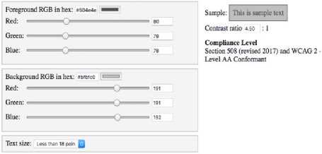
Fig.1. WCAG 2.0 Level AA minimum contrast ratio 4.5:1 for normal text with light background
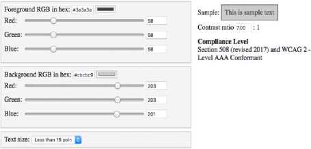
Fig.2. Extended Level AA minimum contrast ratio from 4.5:1 to 7:1 for normal text with light background
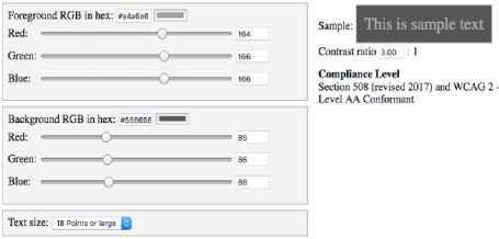
Fig.7. WCAG 2.0 Level AA minimum contrast ratio 3:1 for large text with dark background

Fig.3. WCAG 2.0 Level AA minimum contrast ratio 4.5:1 for normal text with dark background
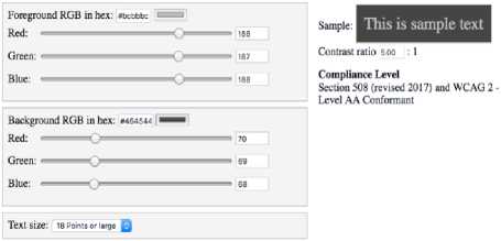
Fig.8. Extended Level AA minimum contrast ratio from 3:1 to 5:1 for large text with dark background
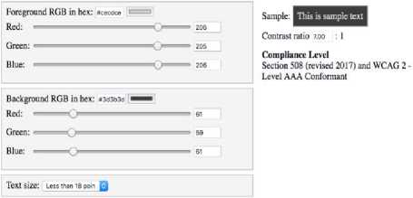
Fig.4. Extended Level AA minimum contrast ratio from 4.5:1 to 7:1 for normal text with dark background
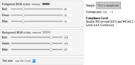
Fig.9. WCAG 2.0 Level AAA minimum contrast ratio 7:1 for normal text with light background
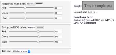
Fig.5. WCAG 2.0 Level AA minimum contrast ratio 3:1 for large text with light background
Fig.10. Extended Level AAA minimum contrast ratio from 7:1 to 9:1 for normal text with light background
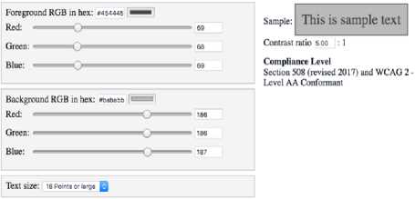
Fig.6. Extended Level AA minimum contrast ratio from 3:1 to 5:1 for large text with light background
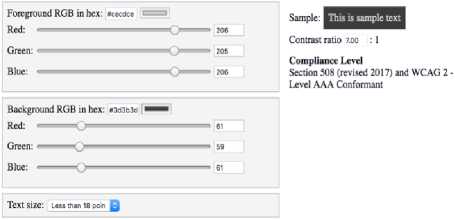
Fig.11. WCAG 2.0 Level AAA minimum contrast ratio 7:1 for normal text with dark background
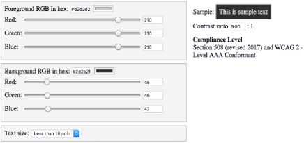
Fig.12. Extended Level AAA minimum contrast ratio from 7:1 to 9:1 for normal text with dark background
resource/color-contrast-checker/).
-
VI. Extends Minimum Color Contrast
The following Table 1 illustrates the extended minimum color contrast ratio compared with existing WCAG 2.0 guidelines.
Table 1. Extended minimum color contrast ratio
|
Terms/Properties |
WCAG 2.0 |
Extended |
|
Level AA-Normal Text |
4.5:1 |
7:1 |
|
Level AA-Large Text |
3:1 |
5:1 |
|
Level AAA-Normal Text |
7:1 |
9:1 |
|
Level AAA-Large Text |
4.5:1 |
6.5:1 |
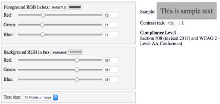
Fig.13. WCAG 2.0 Level AAA minimum contrast ratio 4.5:1 for large text with light background
year, and configuration of your trade-in device. Online and
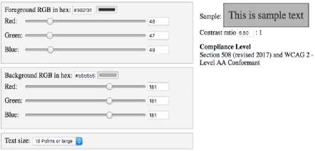
Fig.14. Extended Level AAA minimum contrast ratio from 4.5:1 to 6.5:1 for large text with light background
-
1. Not all devices are eligible for credit. More details are if eligible devices. Restrictions and limitations may apply, ne right to refuse or limit the quantity of any device for any I this information). Value of your current device may be
Г ■ X в= Styles Computed Event Listeners DOM Breakpoints »
Filter :hov .cis + z background-color: D#f2f2f2;
color: ■ #888;
__ padding: ► 17px 0 llpx;
= . Contrast ratio 3.17 : 1
@ z-index: 1;
> :
year, and configuration of your trade-in device. Online and
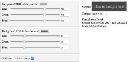
Fig.15. WCAG 2.0 Level AAA minimum contrast ratio 4.5:1 for large text with dark background
I. Not all devices are eligible for credit. More details are
le right to refuse or limit the quantity of any device for any this information). Value of your current device may be
I : x
-
*= Styles Computed Event Listeners DOM Breakpoints »
Filter :hov .cis +^
color: ■ #6t6f6d;
padding:► 17px 0 llpx;•
’ J background-color: #f2f2f2;,
-
#ac-globalfooter *, #ac- Contrast ratio 4.50: 1
| globalfooter *:before, #ac-globalfooter *:after {
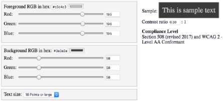
Fig.16. Extended Level AAA minimum contrast ratio from 4.5:1 to 6.5:1 for large text with dark background
. Not all devices are eligible for credit. More details are f eligible devices. Restrictions and limitations may apply. ie right to refuse or limit the quantity of any device for any this information). Value of your current device may be
: x
= Styles Computed Event Listeners DOM Breakpoints »
Filter :hov .cis +^
color: e#525250;
-
• I padding: ► 17px 0 llpx; ■
The color contrast checker tool was used in the experiment;
-
VII. Analysis and Discussion
The Fig.1 applied the WCAG 2.0 minimum contrast ratio Level AA 4.5:1 for normal text (less than 18 points) with a light background, and in Fig.2 extended the contrast ratio to 7:1 within similar properties while the text is brighter than Fig.1. In Fig.3 and Fig.4 applied respectively former values with a dark background and light foreground, where the extended ratio of Fig. 4 is brighter than the Fig.3. The Fig.5 applied WCAG 2.0 minimum contrast ratio Level AA 3:1 for large text (18 points and larger) with a light background, and in Fig.6 the color contrast extended to 5:1 and the text is brighter than in Fig.5. In Fig.7 and Fig.8 applied the contrast ratio respectively WCAG 2.0 3:1 and extended 5:1 with similar properties into the dark background and light foreground, while the extended ratio 5:1 in Fig.8 is brighter than Fig.7.
In Fig.9 applied the WCAG 2.0 minimum contrast ratio Level AAA 7:1 for normal text with a light background, and in Fig.10 extended the contrast ratio to 9:1 within the similar properties while the text is brighter and visible than the Fig.9. In Fig.11 and Fig.12 applied respectively the prior values with a dark background and light foreground, where the extended ratio applied in Fig.12 is brighter than Fig.11. In Fig.13 applied WCAG 2.0 minimum contrast ratio Level AAA 4.5:1 for large text with a light background, and in Fig.14, the color contrast extended to 6.5:1 which is brighter than Fig.13. In Fig.15 and Fig.16 applied the contrast ratio respectively WCAG 2.0 4.5:1 and extended 6.5:1 within similar properties into the dark background and light foreground, while the extended ratio 6.5:1 in Fig.16 is clearer than the text in Fig.15.
In Fig.17, shows few texts in the Apple.com official home page, where the color contrast ratio was 3.17:1, on account of WCAG 2.0, it requires to 4.50 which applied in the Fig.18 and it differs the color ratio and clarity than Fig.17. In Fig. 19, applied the extended minimum ratio of 7:1, and text is brighter than Fig.17 and Fig.18. In Fig.17, 18 and 19, the background HEX value was #f2f2f2, which is identical, and the foreground values were respectively #888888, #6f6f6d and #525250, therefore, the contrast ratios are different in the three figures and brighter and darker than one another. In Fig.19, the text is brightest than Fig.17 and 18 being the highest contrast ratio among the three figures.
The WCAG 2.0 guideline is the standard minimum color contrast ratio in web application content, although the ratio is extendable by its requirement. Moreover, this research tries to establish a standard level of minimum contrast ratio by extending ratio values. Above figures show the clarity and luminance of the text where applied the minimum WCAG 2.0 ratio and the extended contrast ratio as well. The experiment evident the text with the extended ratio is more visible and brighter than the text with contrast ratio of WCAG 2.0. The extended ratio highlights a new standard level of the minimum color contrast ratio in the web application content design.
-
VIII. Conclusion and Future Work
In HCI, the visual appearance of such visibility is a significant term for better interaction with a system. It relates with user involvement and satisfaction. The guidelines of WCAG 2.0 refers to web content design with minimum color contrast ratio for appropriate luminance and clarity. The guidelines of the WCAG 2.0 minimum contrast ratio is further extendable for its various requirements, and therefore, the analysis shows the existing minimum ratio is not fair visible and clearer in light and dark background and foreground, although the ratio is minimum and extendable. In the context, the extended minimum contrast ratio evident bright and clear contents comparing with WCAG 2.0 minimum contrast ratio. The extended contrast ratio is the new standard minimum color contrast ratio for the design of web application content which is the contribution of the research that presented in the Table 1.
The research is an experimental approach, that extended the color contrast ratio for the design of web contents. The limitation of the research is required to apply the extended minimum contrast ratio on diverse web application contents design and evaluate the acceptance of extended contrast ratio through the mass level of user participation. The future work suggested to analyze further and apply the extended contrast ratio on other visual components in the web application.
References The impact of web contents color contrast on human psychology in the lens of HCI
- Caldwell. B, Cooper. M, Reid. L. G, and Vanderheiden. G, “Web content accessibility guidelines (WCAG) 2.0,” WWW Consortium (W3C), 2008, pp. 1-133.
- Gauss. Stephan, “Fundamentals of colour perception,” Colour Technology of Coatings (Wilhelm Kettler et al.), Germany, 2016, pp. 15-20.
- Cakir. M, Ozturk. B. T, Turan. E, Gonulalan. G, Polat. I, and Gunduz. K, “The effect of hypothyroidism on color contrast sensitivity: a prospective study,” European thyroid journal, 4(1), 2015, pp. 43-47.
- Singg. S and W Mull. C, “Effect of Color on Information Retention by Young Men and Women,” Juniper Online Journal of Case Studies, 2(4). doi: 10.19080/JOJCS.2017.02.555591, 2017, pp. 1-3.
- Ahamed. M, “Developing a Message Interface Architecture for Android Operating Systems,” American Scientific Research Journal for Engineering, Technology, and Sciences (ASRJETS), 14(3), 2015, pp. 54-65.
- Talaei. M, “Study of Human Reactions than Color and its Effects on Advertising,” International Journal of Accounting Research, 42(827), 2013, pp. 1-9.
- Kurt. S and Osueke. K. K, “The effects of color on the moods of college students,” SAGE Open, 4(1), 2014, pp. 1-12.
- Aghdaie. S. F. A and Honari. R, “Investigating the Psychological Impact of Colors on Process of Consumer Shopping Behavior,” International Review of Management and Business Research, 3(2), 2014, pp. 1244-1252.
- Kumar. S, Sterkenburg. J, Diekfuss. J, and Jeon. M, “Color effects on students’ emotions and task performance in a web-based learning management system,” Proceedings of the International Conference on Multimedia and Human Computer Interaction, Canada, 2013, pp. 1-5.
- Vitols. G, Arhipova. I, Hirata. Y, and Ikarts. I, “Colour Extraction and Analysis Solution for Design of Cross-cultural Websites,” Procedia Computer Science, 77, 2015, pp. 215-220.
- Rello. L and Bigham. J. P, “Good Background Colors for Readers: A Study of People with and without Dyslexia,” In Proceedings of the 19th International ACM SIGACCESS Conference on Computers and Accessibility, ACM, 2017, pp. 72-80.
- Richardson. R. T, Drexler. T. L, and Delparte. D. M, “Color and contrast in E-Learning design: A review of the literature and recommendations for instructional designers and web developers,” MERLOT Journal of Online Learning and Teaching, 10(4), 2014, pp. 657-670.
- Olurinola. O and Tayo. O, “Colour in Learning: Its Effect on the Retention Rate of Graduate Students,” Journal of Education and Practice, 6(14), 2015, pp. 1-5.
- AL‐Ayash. A, Kane. R. T, Smith. D, and Green‐Armytage. P, “The influence of color on student emotion, heart rate, and performance in learning environments,” Color Research & Application, 41(2), 2016, pp. 196-205.
- Brooker. A and Franklin. A, “The effect of colour on children's cognitive performance,” British Journal of Educational Psychology, 86(2), 2016, pp. 241-255.
- Ahamed. M. M and ZA. Bakar, “Analysis of Human Machine Interaction Design Perspective-A Comprehensive Literature Review,” International Journal on Contemporary Computer Research (IJCCR), 1(1), 2017, pp. 31-42.
- Gundlach. B. S et al., “Design considerations for the enhancement of human color vision by breaking binocular redundancy,” Scientific reports, 8(1), 2018, pp. 1-8.
- Elliot. A. J, “Color and psychological functioning: a review of theoretical and empirical work,” Frontiers in Psychology, 6, 2015, p. 368.
- Chang. B, Xu. R, and Watt. T, “The Impact of Colors on Learning,” Adult Education Research Conference 2018, Canada, 2018, pp. 1-7.
- Dzulkifli. M. A and Mustafar. M. F, “The influence of colour on memory performance: A review,” The Malaysian journal of medical sciences: MJMS, 20(2), 2013, p. 3.
- Mithun. A. M, Bakar. Z. A, and Yafooz. W. S, “Revised Theoretical Approach of Activity Theory for Human Computer Interaction Design,” In Science and Information Conference, Springer, Cham, 2018, July, pp. 803-815.
- Sandnes. F. E and Zhao. A, “An interactive color picker that ensures WCAG2. 0 compliant color contrast levels,” Procedia Computer Science, 67, 2015, pp. 87-94.
