Tree Adapt: Web Content Adaptation for Mobile Devices

Автор: Rajibul Anam, Chin Kuan Ho, Tek Yong Lim
Журнал: International Journal of Information Technology and Computer Science(IJITCS) @ijitcs
Статья в выпуске: 9 Vol. 6, 2014 года.
Бесплатный доступ
Mobile web browsing usually becomes time-consuming since currently it requires horizontal and vertical scrolling in addition to this, users interested in only a section of a web page are often burdened with cumbersome whole web pages that not only do not properly fit their mobile screens but also require a lot of delivery time. This problem can be addressed and resolved with the help of a mobile web content adaptation system. Existing web content adaptation systems focus on resizing contents to fit a mobile device and removing unnecessary contents from the adapted web page. This paper’s aim is to address the gap by proposing the TreeAdapt which provides a condensed view of an adapted web page. This condensed view consists of only block headers which users can then expand for complete content. In order to achieve this, the proposed algorithm will first categorize an HTML object as menu, block title or the main content. A depth-first traversal algorithm is then used to select the sequence of blocks to be displayed on a mobile device. Usability studies were performed to evaluate the usability of the adapted contents against other deployed systems. Results from the usability studies indicate that the adapted contents produced by the proposed techniques enabled users to locate targeted information within a web page in a shorter span of time.
Content Adaptation, TreeAdapt, Mobile Web Content, Smart Phone
Короткий адрес: https://sciup.org/15012148
IDR: 15012148
Текст научной статьи Tree Adapt: Web Content Adaptation for Mobile Devices
Published Online August 2014 in MECS
The pervasive or ubiquitous computing is called the third wave computing. The term ubiquitous means that technology is everywhere and people use it all the time when they need [1]. On the other hand, among all the mobile computing devices, mobile phone is the most popular and mobile internet browsing is part of the ubiquitous computing trend. The term mobile device as a device specially designed for synchronous and asynchronous communication while the user is on the move [2]. The term “Mobile Web” was introduced when internet services for mobile devices started to use html based (W3C) standards for delivery [3]. The mobile web refers to any mobile device like smartphone or tablet computer connected to a wireless network by using internet connected application or web browser [4]. Among the mobile devices, mobile phones and PDAs are the most popular. Moreover, one of the facilities which contribute to this popularity is the accessibility of the internet [5] and more than six billion peoples all over the world are using web in the mobiles [29]. However, mobile phones provide good mobility but very limited computational capabilities and screen size [6].
Mobile web content adaptation refers to techniques that dynamically adjust the contents according to the properties of the handheld devices for better presentation [7]. Many different screen sizes are currently available in mobile phones. Typical mobile phone screen resolutions are 128×96, 160×120, 176×144, 208×176, 220×176, 320×240 and 352×288 pixels [8]. The smart phone screen resolutions are 400×240, 480×320, 640×360 and 800×400 pixels [9]. Accessing the same content from a small-screen device (smart phones with screen sizes about 20 times lesser than that of a desktop screen) requires horizontal and vertical scrolling which is not comfortable for the user. Therefore, small screens provide less visible opportunities at any given time, requiring users to rely on their short term memory to build an understanding of web information [10].
The main purpose of this paper is to develop a mechanism to adapt the web contents for smart phone. This paper focuses on the techniques needed to adapt all kinds of text contents and also focuses on the techniques to change the html elements of the image, audio, flash and video contents in the web page so that the contents appear properly on the mobile screen.
In this paper, our proposed techniques which adapt web contents to improve mobile web browsing. The TreeAdapt first transformed to an html tree containing all the contents of a web page. The system then adds other functionality to the HTML tree and selects contents from the HTML tree. The most interesting technique of this framework is that it provides a condensed view of an adapted web page by toggle functionality. The toggle functionality is added to each block title in a web page. This provides a condensed view consisting of only block titles that users can then expand into complete content.
The rest of the paper is organized as follows. In section 2, provides detailed background of other existing deployed mobile content adaptation systems and discusses about the other adaptation frameworks. The proposed framework of TreeAdapt, detailed comparisons with other existing systems are described in detail in section 3. In section 4, provides the analysis of the results of the experiments. Finally, presents the summary of the investigation and report in section 5.
-
II. Related Works
Many types of mobile web content adaptation systems have been deployed but only a few of them like Skweezer and Mowser have been commercialized for public use, these systems are not open source and the techniques the developers use to deploy the systems are not open to public. On the other hand, in order to develop and improve the much needed mobile web content adaptation frameworks, researchers over the years have applied different types of experimental methods of which some are automated and some semi-automated. The next section discusses both the deployed and experimental systems in detail.
-
A. Deployed Web Content Adaptation Systems
As mentioned earlier, mobile web browsing requires web content adaptation system for better web browsing on the mobile phone. There are many deployed adaptation systems that not only contain most of the required adaptation features but also serve all kinds of web pages for mobile devices. Skweezer is a deployed web content adaptation system. It adapts web pages designed for the desktop environment browsing and allows its users to access their favorite sites from mobile phones [11]. It reduces bandwidth consumption because it removes the background color and images. It automatically searches the web using Ask.com indexing. However, Skweezer is unable to adapt image files like png, tif and tga, along with audio and video files. Therefore, these types of multimedia files don’t appear on the web pages after adaptation. Mowser is a deployed web content adaptation system that converts web pages in a predictable and linear manner so that the users can view the adapted web pages properly on mobile screens. In order to deliver productive web pages on a mobile device, it alters images and text format in certain aspects of web page functionality [12]. Mowser adapts all kinds of web pages and delivers the contents in one dimensional (1D) [13] web pages. As a consequence, the users need to scroll horizontally and vertically. After adaptation some text information and links appear more than once while other texts and images don’t appear on a separate or new line.
-
B. Experimental Adaptation Frameworks for Mobile Devices
Many experimental web content adaptation systems have been developed over last few years like the CMo, Annotation-based Web document Framework, Xadaptor and Web Page Tailoring Framework.
The CMo [14] reduces information overload and thereby allows its users to see the most relevant fragments of the web pages and to navigate between fragments if necessary. The Interface Manager receives the request from the user, produces html contents and delivers the requested page to the user. The Context Analyzer starts processing after the user uses the navigation. The analyzer collects the context of the link which relates to the links and text around the links. When a user navigates to a new page, the Context Analyzer uses the support vector machine to select the most relevant context from the new page and delivers it to the user. The Browser Object retrieves the contents from the web page and transfers them into a Dom-tree. The Frame Tree Processor combines all the contents from the Dom-tree and renders it to the users [14].
Annotation-based Web document Framework [15] comprises of two components such as page clipping for small-screen devices and page clipping for portal site development. The page clipping for small-screen devices checks the user's HTTP request header. It then identifies the device type and retrieves the HTTP requests from the site. Afterwards it transfers the web page into a tree, adds page-clipping annotation in the tree and uses the annotation-based page-clipping engine to render the page ready for the mobile devices. The page clipping for portal site development is a server-side component. The portal creates an annotations-based clipping portlet. It combines the dynamic content of the portal and delivers the output to the mobile devices [15].
Xadaptor [16] comprises of client database, rule-base and tree processing elements such as content parser, inference engine and content converter. The database keeps the client’s profile. Each client profile maintains the information of a client's preferences and mobile device information. The rule-base maintains various types of rules to adapt the contents. The content parser extracts the original page and breaks the parser into small objects. The Inference engine applies the rules from the client database to the objects and the content converter changes the format of the objects [16].
The Web Page Tailoring System [17] keeps tracing every movement on the mobile browser. This framework retrieves the user preferences and rearranges the web page layout according to these preferences. The Configure Manager stores the user preferences and the contents get adapted according to the user’s preferences. The Configuration Manager filters out the web page, rearranges the contents and delivers it to the users [17]. Most of the steps for these adaptation frameworks are same but the techniques are different from each other.
-
III. Proposed Solution
The TreeAdapt is an automated mobile web content adaptation system. Figure 1 illustrates the home page of the TreeAdapt. Figure 2 illustrates the framework of the TreeAdapt. First, when a user requests for a web page, TreeAdapt downloads the web page source (in HTML). Secondly, TreeAdapt constructs an HTML tree from the web page. Thirdly, TreeAdapt identifies important blocks from the tree and sends it to the Reorganize Tree by Object Types algorithm. The Reorganize Tree by Object Types algorithm identifies the navigation bar, block titles and main contents from the HTML tree and tags them as contents and sends the html tree to the pre-processing algorithm. Then the area assignment algorithm in turn assigns area to each object of the HTML tree (an area assigned to a block refers to the space it occupies on a mobile device’s screen). Next, the toggle functionality algorithm adds toggle functionality to each block title of the HTML tree. After this, the depth-first traversal algorithm selects the tag objects from the tree and sends it to the TreeAdapt. Fourthly, when the user opens a navigation link then the TreeAdapt sends the HTML tree to Content Identification after Navigating to another Page process. The algorithm tags each matched contents and sends the html tree to the depth first traversal algorithm. Fifthly, the depth first traversal algorithm sends the subpages to the TreeAdapt. Finally, the TreeAdapt sends the subpages to the user’s mobile devices. This adaptation process is discussed in details in the following sections.
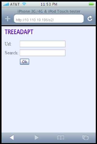
Fig. 1. Homepage of the TreeAdapt.
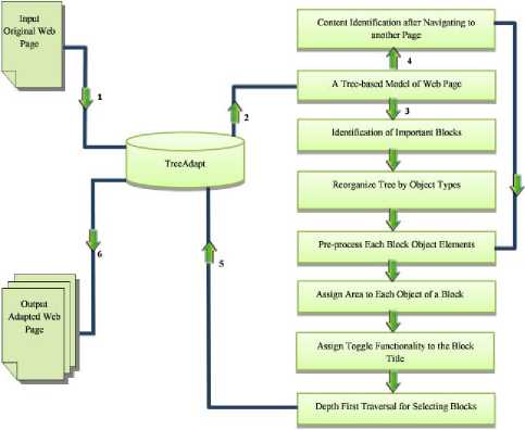
Fig. 2. The Frame Work of TreeAdapt
-
A. A Tree-Based Model of Web Pages
Hyper Text Markup Language (HTML) is the generic name for the group of languages that form the lingua franca of the World Wide Web [18]. An HTML file can be easily converted into a tree structure. Dynamic updates can be easily performed on the web page by modifying the tree. An HTML tree is defined as T = ( V , E ), where V is set of vertex and E is the finite set of edges in the tree [19]. Each node of the tree contains an html object.
-
B. Identification of Important Blocks
The Blocks process which uses the depth first traversal method to traverse the html tree. It identifies the important blocks (which are identified by using structure functionality [6] and contains only the important contents [20]) by analyzing the html elements and keeps the blocks in the html tree [21]. If it identifies any object like Java Script and CSS (
-
C. Reorganize Tree by Object Types
This algorithm is used to categorize objects as navigation bar (menu), block heading (block title) and main content (list of anchor texts linking the actual content and details information) [7], [23], [24], [28]. After categorizing these three types of objects in the HTML tree, the algorithm tags them. The algorithm searches the objects from the html tree for identification of objects.
Input:
-
v is a vertex of a tree;
Output:
-
v with tag object;
Variables:
-
m atch, title, menu, information content are tag objects;
AssignmentOfCategory ( v )
-
1. If v matches with search keyword and preference enable Then
-
2. Tag v p = match ;
-
3. Create new left child of the root and shift v to the new left
-
4. If v is a title object Then
-
5. Tag v p = title ;
-
6. If v is a hyperlink object Then
-
7. If text length is less than 13 Then
-
8. Tag v p = menu ;
-
9. If text length is equal or more than 13 Then
-
10. Tag v p = information content ;
-
11. If v is a text object Then
-
12. Tag v p = information content ;
-
13. If v is a multimedia object and v resolution more than 21 ---^----------------------------
- Fig. 3. Algorithm for categorize the objects of a block
child ;
If the user keys in any search keyword (Figure 1) to search within the web page the algorithm searches the keyword in the branches of the HTML tree. In Figure 3 (see lines 1-3) if the algorithm finds any keyword that matches the user’s keyword, then it tags the object as a match and assigns it to vp; it then removes the matching node from the child nodes and adds a new left child node to the root of the tree (Figure 4) and assigns the matching node to the branches of the new left child node. Certain HTML elements are used to format the content such as title or heading [6] which makes the contents more attractive and important to the users. The algorithm Figure 3 (see lines 4-5) searches all types of block title elements, and upon finding the element tags the object as title and assigns to vp. Hyperlinks are categorized into two types namely Menu (navigation bar) and Content (navigation list) Hyperlink [7]. The navigation menu or bar is usually placed vertically on the left, right or horizontally near the top of the web page. Another type of hyperlink used as contents (navigation list) which navigate to the main content. This kind of object is considered as content. If a hyperlinks’ text length is less than thirteen (it is not a sentence), then it is considered as a menu item [7] and all other hyperlinks are considered as content. The algorithm (see line 6-10) searches for the hyperlink object and checks the text length of the object. Firstly, if the text length is less than 13 [7], it tags the object as menu. Secondly, if the text length is more than 12, then it tags the object as content. Text and multimedia objects are used to deliver information that is considered as main content. In (line 11-12) the algorithm searches for the text contents in the HTML tree. If it finds any text object, it tags the object as content. Multimedia objects are also tagged as main content but in case of images with less than 21 pixels in width, they are either regarded as a symbol of navigation or used to fill the blank space in the web page. Thus, the images are tagged as content if the width pixels are more than 21. In (line 13-14) the algorithm searches for images.
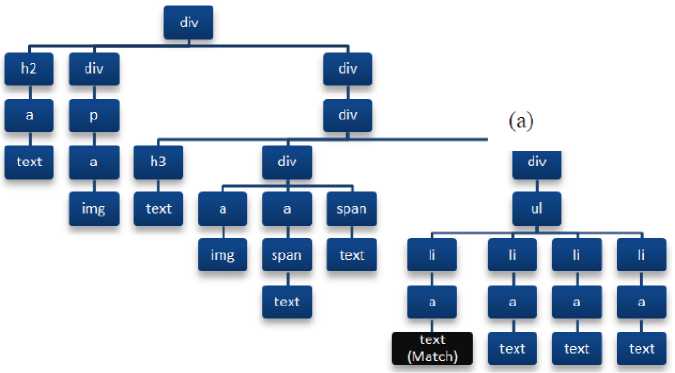
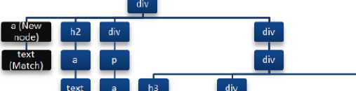
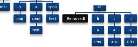
Fig. 4. (a) A tree representation with matched keyword in the text object and
(b) the matched node cut from the tree and add a new left child node (text object) to the root of the tree.
-
D. Pre-Processing of Blocks
Some multimedia object’s areas (height × width) exceed the mobile screen size. On the other hand, while other multimedia objects’ width is suitable for mobile view, their height exceeds the mobile screen height. Therefore, to enhance web browsing [25] this kind of object needs to be resized for better presentation in the mobile devices. In Figure 5 (line 1) the algorithm illustrates Iscreen which contains the estimated maximum suitable multimedia content’s width and height according to the mobile screen resolution. Let
DeviceWidth and DeviceHeight be the mobile screen width and height, 200 is the threshold for the image. So, Iscreen contains the maximum height and width for the multimedia object. The algorithm (see line 2) first extracts all the HTML decoration elements and modifies the background color of the HTML elements from the html tree. Secondly, it modifies the multimedia content dimension properties. If the multimedia content’s height is more than Iscreen (see line 6-8), it reduces the multimedia content’s dimensions. Thirdly, if the multimedia content’s width is more than Iscreen (see line 9-11) then it reduces the multimedia content’s dimensions. This algorithm maintains the original aspect ratio of the multimedia contents and reduces the dimensions to suit the mobile screen.
Input:
v is a vertex of a Tree;
Output:
-
v with new height and width;
Variables:
height, width are the object height and weight;
DeviceWidth, DeviceHeight are the mobile screen height and weight;
200 is the threshold for an image;
Preprocessing ( v )
-
1. Iscreen = ( DeviceWidth / DeviceHeight ) × 200 ;
-
2. If v is decoration or highlight element Then
-
3. Remove the element from v and change the background
-
4. If v is multimedia element and multimedia height , width more than Iscreen Then
-
5. Ratio = height / width ;
-
6. If height > Iscreen Then
-
7. newheight = Iscreen ;
-
8. newwidth = height / Ratio ;
-
9. Elseif width > Iscreen Then
-
10. newwidth = Iscreen ;
-
11. newheight = width × Ratio ;
-
12. update v with the newwidth and newheight ;
-
21. End
color properties and reduce the font size;
Fig. 5. Algorithm for pre-processing of blocks
-
E. Assignment of Area to Each Object in a Block
The area of an object is its height × width . With the consideration of the area the Depth First Traversal algorithm selects limited amounts of object for each subpage. The algorithm assigns area to each object according to the text length and multimedia object dimensions. Figure 6 (see line 1-2) shows how the algorithm transforms the text lengths to pixels. Here v a is the area of the object, 10 is the pixel size for the single character, and 30 is the threshold for each single line pixels, number of text character is the number of character in the object [16]. Figure 6 (see lines 3-4) shows the algorithm where the height of the image is the height of the multimedia content and width of the image is the width of the multimedia content. The v a is the area of the object.
Input:
v is a vertex of the tree;
Output:
v with area;
Variables:
number of text character is the text objects character length;
-
30 is the pixel threshold for each line;
-
10 is the pixel for each character;
AssingArea ( v )
-
1. If v is text object Then
-
2. Assign area to v a = v a + ( 30 + 10 × number of text
-
3. If v is image object and image height or width pixels > 20 Then
-
4. Assign area to v a = v a + ( height of the image × width of
character );
Fig. 6. Algorithm for assignment of area to each object in a block.
-
F. Organizing Block Contents Using Toggle Functionality for the Block Title
The block title contains the shortened information of the body (main content). Consequently, a user can predict the main content of the block by looking at the block title. This algorithm searches the HTML tree for the objects that are tags like title and content . It adds an additional navigation object (toggle functionality) to the block title (tag as title ) and hides the block body (tag as content ).
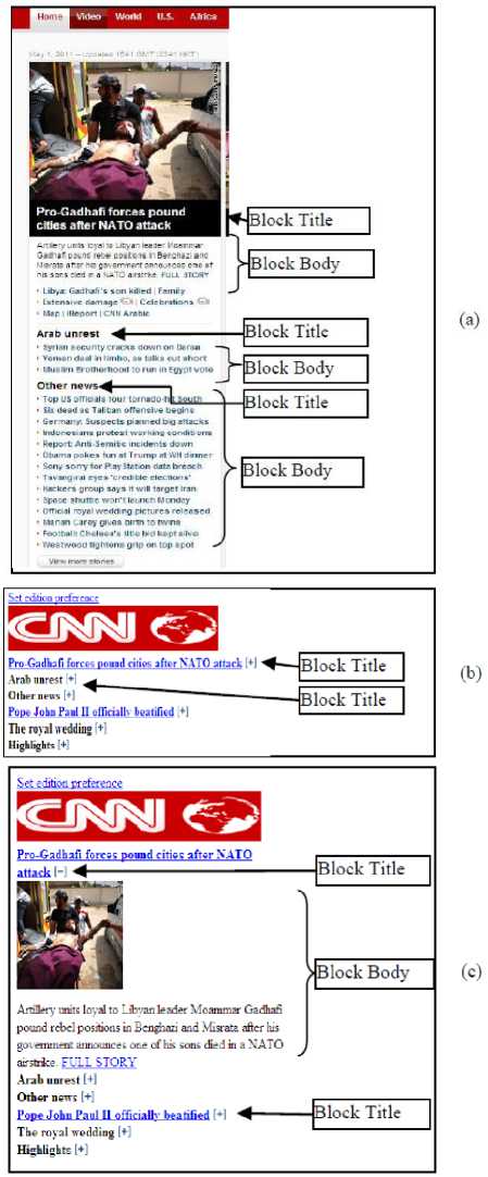
Fig. 7. (a) CNN homepage contains block title and block body with information, (b) Adapted CNN homepage contains block title with navigation and block bodies are hidden, (c) Adapted CNN homepage after toggling the block title navigation. The block body appears to the screen.
Input:
v is a vertex of a tree;
Output:
v with toggle object ;
BlockToggle ( v )
-
1. If v tag as title object Then
-
2. Assign v t = add toggle object ;
-
3. If v has neighbor Then
-
4. If all neighbor w tag as information content Then
-
5. Assign v t = hide all w i ;
-
6. If toogle the title object Then
-
7. Display the hidden information content ;
Fig. 8. Algorithm for organizing block contents using toggle block title.
Figure 7.a, depicts the CNN homepage that contains the block title and block body. Figure 7.b shows the same web page after adding the toggle functionality to the block title object with extra symbol added to the block title as the navigation and block body contents get hidden. If the user clicks on the block title plus symbol the block body expands in the browser. Figure 7.c, illustrates the block title with the minus symbol, which upon clicking, expands the block body. With this method, contents can be delivered to the user’s mobile device. Figure 8, shows the algorithm where v is the vertex of a tree and v t contains the additional toggle functionalities. If the algorithm finds any tag title object, it assigns the toggle object to the block title. After the search for the block body contents (see line 1-2) if it find any content (tag as content ) then it hides them from display. If the user toggles (clicks the title navigation symbol) then (see line 6-7) the hidden block body appears on the screen.
-
G. Depth First Traversal Algorithm to Select Objects
The depth-first traversal algorithm traverses the HTML tree, picks the tag objects and limits the content quantity in every subpage by the area of the objects. The total area of the objects cannot exceed the mobile screen area (height × width) for each subpage. Figure 9, illustrates the subpage generator scheme from the HTML tree using depth first traversal method. Here contents i is the tree object, a i is the area of the object, and t i is the tag information of the object assigned by i th item, A is the area based on the screen mobile dimension ( Height × Width ). The depth first traversal algorithm traverses the HTML tree, selects the objects and the total area (of the objects) that must be smaller or equal to the A . When the area turns out to be more than the area A , then the depth first traversal algorithm stops traversing the HTML tree and assign a pointer to that edge of the html tree so that the next iteration can start from this pointer. Afterwards the algorithm delivers the selected contents in a subpage. The next and previous buttons are used to direct to the next and previous subpages. On the condition that next is true, (see line 1) subsequently the algorithm traverses the unvisited edges of the HTML tree, tags the edges as visited and adds the objects in the subpage (see lines 4-7). In the event that the previous is true (see line 11) the algorithm traverses the visited edges of the tree, tags the edges as unvisited and adds the objects in the subpage (see lines 14-15). In this way the depth-first traversal algorithm formulates the subpages from the tree.
Input:
-
v is a vertex of a tree;
Output:
-
subpage contains tree objects;
Variables:
-
t is the tag info of a object; contents is a object of a tree ;
A is the area of a mobile screen; a is the area of a object; next is the next button;
-
previous is the previous button;
DFS ( v )
-
1. If next = True Then
-
2. If area + a i ≤ A Then
-
3. v = visited;
-
4. If t i is tag Then
-
5. subpage = subpage append contents i ;
-
6. If t i tag as title Then
-
7. area = area + a i ;
-
8. For each neighbor x of v
-
9. If x is unvisited Then
-
10. DFS ( x );
-
11. Elseif previous = True Then
-
12. If area + a i ≤ A Then
-
13. v = unvisited;
-
14. If t i is tag Then
-
15. subpage = subpage append contentsi ;
-
16. If t i tag as title Then
-
17. area = area + a i ;
-
18. For each v of neighbor x
-
19. If v is visited Then
-
20. DFS ( v );
Fig. 9. Depth first traversal algorithm for selecting blocks.
-
H. Content Identification after Navigation to another
Page
Some web pages put only the condensed information (as link) on the home page. A user needs to navigate to another page to read the main contents of the condensed information (link) [14]. So, this algorithm identifies the important contents from the subsequent page according to the navigation content from the first page.
The algorithm provides only the related contents to the user which helps to get the important contents faster. Figure 10.a, shows the adapted home page of the CNN web site. Suppose a user selects the “Story of slavery touches Taiwan” link to read the main content. The algorithm adapts the navigated page and identifies the important blocks from the html tree. This algorithm searches for the related contents “Story of slavery touches Taiwan” in the HTML tree and selects those objects that match the related content. Figure 10.b, illustrates the first subpage after adapting the navigated page and Figure 10.c, shows another subpage containing the contents related to “Story of slavery touches Taiwan”. Figure 11, (lines 1-2) shows that the algorithm first searches all the text objects, then tags them as match if the object text data matches with the navigation text. Next the algorithm searches for the multimedia objects (see lines 3-4) and tags them as match if the object’s metadata (multimedia content) matches with the navigation text content. Afterwards it delivers only the tag objects to the mobile.
Clooney. Rinaldo ctBcduscow tnti?
Pakistani I aabm dxra attack on pekoe
Chin* passes U S in smartphone sales
Clwgrs filed tn L' S Awesh ЬежЛ case
C it and meun g«*
Lgyp:: U.S. students to atoy detuned iHeport .Axe vou theie^
CNN Antic"
кешеп after Saleh: a treacherous road (—J
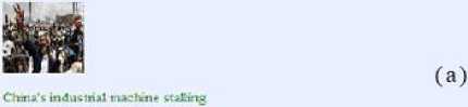
I ihnr Severe Znside Cxro 1 no: голо Cat and mouse fame in . ahnr Saiare Story of atovay touches Tevin} Tarnished irrege of South Africa* ANC Afglsan rap* victim rretains in jail
С 0П2О *1»сэдп to tatt counux'i < мио изо,’ CNN's Stan Си* ds*t inwwdt
I Pluvious j pase 5 14 | Iduxt |
TREE ADAPT ♦ z4*e^ »t-r^6

Isabel was sold by her mother when she was about seven to a wealthy family who later moved to Cilifotnia
She endured a cInldhood of cooking, cleaning and beatings while she lived ей the family's diecarded scraps. She only escaped when she was in her 20s but no criminal charges were brought against the fantilr whо made her childhood a living hell
The Taiwan government has offered to reunite Isabel with relatives if they determine airywsic who is definitely related to Isabel - and if Isabel wants a reunion And. surprising!', the vowng roman semis to want to reunite with her mother who sold her off to slaters.
Г at ruzn l.iuustei I ma th v Yens sail. We he' e to \ rid" csHullv "Ae dou t want to hr* » mote damage '.o het feehngs sol **ч!1 do my ven* best and **tU жакту colleagues back home — to help me make suit its the nsht fanujy she s locking
1 know front my talk vith her she 5 very much no tried a boat her motheE She wants to go back to latw an to set her mother and diet is soanedung we can arrange. I can ht-lp."
He eel* "I went to smr thank у oe BrCNN, roportlng the story of Isabel louthed our people a hutarh indue were neells shocked to hear her story bin new mi gm s nt bi ent and my ministry derided th si we all! do our very beet to helplier reporting the story of Label
1 kno- 1боЪе1 ts по» епрмпа het hir ve
Pai-. 1 12 [ Next ।
Fig. 10. (a) The adapted CNN page by TreeAdapt on handheld device with navigation to another page, (b) the first subpage of adapted version of the navigated page.
Input:
v is a vertex of a tree;
Output:
v with tag reference;
Variables:
vc is an object;
NavigationContentIdentification ( v )
-
1. If vc matches with navigation text Then
-
2. Tag vm = match ;
-
3. If vc matches with navigation text and vc is a multimedia object metadata Then
-
4. Tag vm = match ;
Fig. 11. Algorithm for content identification after navigating to another page.
-
I. The Implementation and Applications of TreeAdapt
(b)
Figure 12.a illustrates the desktop version of BBC homepage for standard desktop computer view. The same web site viewed using an iPod is shown in Figure 12.b where users need to scroll in both directions to reach the target contents. Figure 12.c shows the BBC home page adapted by TreeAdapt.

TREEADAPT »Л^ ,У„
A FROBLtM ША1 CAN I ht ICNOA1D MORE ABOC T THE PROJECT
Hott to help
• Rrporl Freedom Project ( hallt-ngr

Lot* у »and it the ttews vou use ei«v dev and rd*ntif.
$ few you ft el ееглп .v» riaven’-fte* It r-r* te harder rhea g trwdd tew dvopert. Att you • sb' on hoe censumot' Atpoir Ar# vou • tlav ory ehe* cor.; итог*
I he Number з
Rrcent Poitn
?hctogxapbcs changed by Hais s Rcsuvcks Hkhtr '.kL ^-fltxtedby hedoon Isabel s misery seeches Tsiwaa Violin symbolizos brush * uh sU**tw Hew. fur hertrr Ihes Irwl to clears in I N

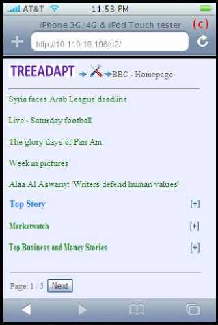
Fig. 12. (a) desktop version BBC homepage, (b) desktop version BBC homepage in mobile, (c) desktop version BBC homepage adapted by TreeAdapt, (d) after toggling the top story title the main contents appears in the mobile screen.
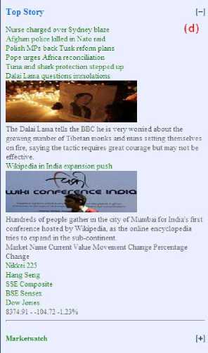
Hundreds of people gather in the cits' of Mumbai for India's first conference hosted by Wikipedia, as the online encyclopedia tries to expand in the sub-continent.
Market Name Current Value Movement Change Percentage Change
Nikkei 225
Hang Seng
SSE Composite
BSE Sensex
Dow Jones
8374.91--104.72-123%
Top Story
Nurse charged over Sydney blaze Afghan police killed in Nato raid Polish MPs back Tusk reform plans Pope urges Africa reconciliation Tuna and shark protection stepped up Dalai Lama questions immolations
The Dalai Lama tells the BBC he is very worried about the growing number of Tibetan monks and nuns setting themselves on fire, saying the tactic requires great courage but may not be effective.
Wikipedia in India expansion push
All the contents are reformatted to suit the mobile screen and long web pages are divided into short subpages with navigation buttons. Figure 12.d shows the result of the “top story” title after toggle. All the contents under the “top story” block appear on the mobile screen. So with this system users can browse more information on their small mobile screens.
-
J. Comparison of TreeAdapt with Existing Experimental Frameworks
There are several significant differences between the TreeAdapt web content adaptation techniques and other existing content adaptation techniques. Therefore, the Xadaptor [16], WebPage Tailoring System [17] and CMo [14] frameworks have been selected for comparison purposes. The proposed TreeAdapt framework consists of six components. Table 1, shows the comparison of the frameworks’ components.
Table 1. Comparison of framework components.
|
Components Used |
_ 11 ^ -S X. |
5 H |
Q. H |
Comments |
|
|
User preferences |
Yes |
Yes |
Yes |
Yes |
System 1 and 3 uses predefined user preferences from database, system 2 manually users select the preferences and system 4 use preferences only by users search keywords. |
|
Representation of html page as Tree |
Yes |
Yes |
Yes |
Yes |
System 1 use structure tree, system 2 use frame tree, system 3 use DOM tree and system 4 uses simple html tree. |
|
Block identification |
Yes |
Yes |
Yes |
Yes |
System 1- 4 identify the blocks by html tags. |
|
Object identification |
Yes |
No |
No |
Yes |
System 1and 4 identify the objects by html tags. Some embedded and navigation objects get removed by the system. |
|
Modification object elements |
Yes |
No |
No |
Yes |
System 1 modifies the objects according to the user database, but system 4 modifies the objects considering the mobile screen size. This helps the contents to fit in the mobile screen. |
|
Toggle the contents for display and hiding |
No |
No |
No |
Yes |
System 4 uses the toggle functionality at the block title for showing and hiding the body of the block. This component hides the body of all the blocks, which makes the page very small and shows only the condensed information. |
|
Use mechanism to select the target contents for display |
No |
Yes |
Yes |
Yes |
System 2 delivers the related information. System 3 delivers information according to the tag pattern matching, and system 4 delivers only the target condensed and details information. |
K. Time Complexity Comparisons of TreeAdapt with Existing Experimental Frameworks
This chapter discusses the time complexity of some algorithms used in TreeAdapt and other frameworks. Table 2, shows the comparison of the algorithms. The first one is the blocks identification algorithm. The blocks identification algorithm complexity in TreeAdapt is O(n) because according to Figure 3, it uses an iterative loop and recursive function where n is the number of edges in the html tree. The FindBlocks [14] algorithm uses iterative loops and the complexity is O(n), where n is the number of nodes in the frame tree. Secondly, the proposed objects identification algorithm complexity is O(n+e) because as in Figure 5, it uses the iterative loop and recursive function, where n is the vertices and e is the number of edges in the tree. However, the FindContext [14] algorithm uses nested iterative loop, where n is the leaf frame nodes. So the complexity is O(n2), where n is the number of nodes from leaf frame tree. Thirdly according to Figure 8 in the object elements modification algorithm, where n is the number of nodes from html tree, the complexity is O(n) and in subpage navigation algorithm [26], where n is the number of nodes in DOM tree, complexity is O(n). Fourthly according to Figure 6 the contents area (height and width) calculation algorithm, where n is the number of edges in the HTML tree, has the complexity of O(n) and in the subpage navigation algorithm [26], where n is number of nodes in the DOM tree, the complexity is O(n). Thus, it is evident that the over-all complexity of the TreeAdapt algorithm is similar to other algorithms except in case of the proposed object identification algorithms complexity which is less than that of the FindContext [14] algorithm.
Table 2. The time complexity comparison of the algorithms.
|
Algorithm |
Time Complexity of Proposed System |
Time Complexity of Other Systems |
|
Blocks Identification Algorithm |
O(n) |
O(n) |
|
Objects Identification Algorithm |
O(n+e) |
O(n2) |
|
Object Elements Modification Algorithm |
O(n) |
O(n) |
|
Contents Height and Width Calculation Algorithm |
O(n) |
O(n) |
-
IV. Usability Study
This section discusses the background of the usability experiment which are designed to investigate the TreeAdapt and Skweezer systems’ efficiency, effectiveness and user satisfaction in some tasks situation. In the following text, TreeAdapt is referred to as TA and Skweezer is referred as SK. The reason for selecting SK for this study is mainly because this system is automated; all the web contents get transformed to small screen view, and furthermore the background and font colors get changed. McGrath [27] developed a practical framework applicable to HCI research. His framework follows a simple structured approach to gather information and evidence. The main reason behind choosing the experimental techniques is that it provides the information to test the hypothesis. The advantage of this method is that it is specific with the task scenario.
-
A. Hypothesis
There are two main hypotheses for this usability study. But H1 has two supporting hypothesis H1a and H1b which helps to prove H1 .
H1 : In mobile web browsing, the addition of toggle functionality to the block titles of a web page helps users to reach the target content faster.
H1a : In mobile web browsing after the addition of toggle functionality to the block titles of a web page, users take less time to reach the target content.
H1b: In mobile web browsing after the addition of toggle functionality to the block titles of a web page, users require lesser number of clicks to reach the target content.
H2 : Mobile web browsing effectiveness is improved by reformatting the original web contents to fit the mobile screen.
-
B. Study Design
In this study to measure the dependent variables one independent variable with two levels TA and SK have been used. There are four dependent variables in this study: task completion time, number of clicks used to complete the task, completion of task and over all preferences regarding the systems. However, these information can’t be observed directly and therefore, can only be taken into account after the compilation of all the data.
The SK has no search option for the adapted web page whereas TA has those capabilities. So, during the usability testing period the search option in the TA would not be visible to the participants.
The participants were recruited from the faculty of computing and informatics, Multimedia University and all of them were final year students. Among the participants there were 19 males and 1 female. The participants were randomly separated into two equal groups A and B. Then participants were asked to fill out a demographic questionnaire form. Figure 13 shows the of the participants demographic information. The groups were introduced to the system functionalities through instructions. Table 3 shows the groups’ sequence of the tasks and time, Table 4 shows the complete tasks.
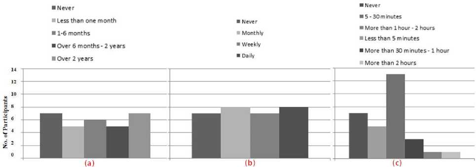
Fig. 13. (a) Participants experiences of using the mobile web, (b) Participants’ frequency of using the mobile web and (c) Participants’ monthly usage of the mobile web
Table 3. Task sequence of groups A and B.
|
Time spend |
GWT |
GA |
|
|
Demographic information |
Group A |
Group B |
|
|
Practice Task |
3 minutes |
Group A |
Group B |
|
Tasks 1 – 6 |
12 minutes |
Group A |
Group B |
|
Questionnaire |
Group A |
Group B |
Table 4. Tasks.
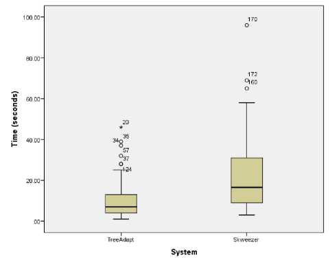
Fig. 14. Completion time to finish all the tasks using TA and SK.
-
C. Results
In this study, the primary concern was that participants would be able to complete the set of tasks more swiftly by using TA than by using SK because of system efficiency. The Figure 14 shows that most of the participants took the least time to finish the tasks using TA than SK. There are one outlier and two extreme points in the TA, and one outlier in the SK because some of the users were not familiar with the mobile web. The Mann-Whitney U test is used to compare the spent time ordinal data. Table 5 illustrates that the median of TA is lesser than SK and that there are statistically significant (Z = -6.864, p < 0.01) differences between time spent in using both systems. This clearly concurs with the H1a hypothesis.
Table 5. Mann-Whitney U analysis of completion time for all the tasks.
|
System |
N |
Median |
|
TA |
90 |
7.0 |
|
SK |
90 |
16.50 |
|
Total |
180 |
|
|
Test Statistics |
||
|
Z |
-5.8922 |
|
|
p-value (2-tailed) |
0.000001 * |
|
The secondary concern was that participants would be able to complete the tasks by less number of clicks using TA than SK because system efficiency depends on it. The Figure 15 shows that most of the participants used the lesser number of clicks to finish the tasks using TA than SK. There are four outliers and one extreme point in the TA because some of the users were not familiar with the mobile web. The Mann-Whitney U test is used to compare the number of clicks ordinal data. Table 6, shows that the median of TA is lesser than SK and there are statistically significant ( Z = -5.8922, p < 0.01) differences between number of clicks used in both systems. This clearly concurs with the H1b hypothesis.
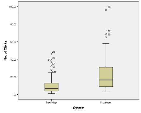
Fig. 15. Number of clicks used to finish all the tasks using TA and SK.
Table 6. Mann-Whitney U test analysis of number of clicks to finish all the tasks.
|
System |
N |
Median |
|
TA |
90 |
10.00 |
|
SK |
90 |
24.00 |
|
Total |
180 |
|
|
Test Statistics |
||
|
Z |
-6.864 |
|
|
p-value (2-tailed) |
0.0000002 * |
|
Although the twenty participants managed to complete all the tasks, the task completion alone did not lead to the final result. Some of the participants completed the tasks but choose the wrong target content and some of them failed to find the target content within two minutes which was considered as failure. When participants managed to find the target content within two minutes of time it was considered as success. Most of the participants managed to successfully finish the tasks on time. However, there were some failure cases as well.
Figure 16 illustrates the tasks completion success and failure percentage by the participants using TA and SK. Table 7, shows that the mean of TA is higher than SK, and that there are statistically significant differences between task completion using both systems (χ2 = 4.063, p < 0.05). Therefore, it can be concluded that the participants’ task completion success was higher in tasks requiring TA than those requiring SK and which in turn concurs with the H2 hypothesis.
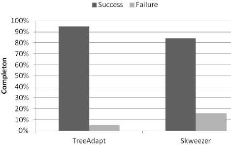
Fig. 16. Total tasks completion by the participants using TA and SK.
Table 7. Chi-square analysis of task completion using TA and SK.
|
χ2 |
N |
Df |
p-value (2-sided) |
|
4.063 |
180 |
1 |
0.04384 * |
|
Mean |
Std. Deviation |
Variance |
|
|
TA |
0.97 |
0.181 |
0.033 |
|
SK |
0.89 |
0.316 |
0.100 |
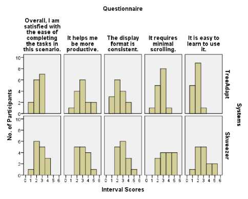
Fig. 17. Graph of questionnaire responses.
After the completion of all the tasks using TA and SK, participants were asked five questions related to the systems’ usability. These questions aimed to assess which system was more effective and user friendly. Questions used five point scales with semantic anchors and responses which were translated to interval scores using 1 to represent strongly agree and 5 to represent strongly disagree. Figure 17, shows all the questionnaires responses. The first, second and third questions (p > 0.05) are not significant as interval scores using TA and SK. The fourth and fifth questions are significant because they reveal differences between interval scores using both systems (Z = -2.433, p < 0.05), (Z = -3.090, p < 0.05). Thus, it is evident that the answers of all the five questions in the questionnaires were not equally significant because group A only use SK while group B only use TA. This affected the interval scores and when the opinions of the TA and SK participants were compared they were found to be almost the same. Thus, the results of this analysis support the H2 hypothesis.
-
V. Conclusion
The main objective of this research is to propose new algorithms for adapting the layout of web content for mobile devices. To fulfill the objectives of the TreeAdapt have been proposed to improve the efficiency and effectiveness for mobile web browsing. The TreeAdapt is an automated mobile web content adaptation system. A case study was designed and conducted in the form of the laboratory experiment with twenty participants. All the participants were given iPhone emulator with six tasks to complete using TreeAdapt and Skweezer. Upon completion of the tasks the participants’ usability preference questionnaire feedbacks about TreeAdapt and Skweezer were collected. After that all the experimental data were combined and statistical analysis to verify the significance of the variables was conducted in due course. The statistical results support the hypothesis H1 and H2 . So, TreeAdapt helps the users to reach the target contents easily and enhances browsing capabilities for the users.
However, with the wide scope of future research there are possibilities of overcoming these limitations and of leading the study in many directions. Firstly, the adaptation mechanism should be extended to the tablet pc and other small screen mobile devices. Secondly, there are some web pages which don’t have proper html structures (not follow W3C); a mechanism could be built to adapt such unorganized web pages. Finally, there are different sizes of mobile phone screens available and fuzzy rules mechanism could be used to adapt the contents for these different sizes of screens.
Список литературы Tree Adapt: Web Content Adaptation for Mobile Devices
- Hooft, M. and Swan, K. (2006). What Is Ubiquitous Computing? [online]. Available: www.rcet.org/ubicomp/what.htm [2009, July 10].
- Blekas, A., Garofalakis, J. and Stefanis, V. (2006). Use of RSS feeds for Content Adaptation in Mobile Web Browsing. International Conference on International Cross-disciplinary Workshop on Web Accessibility, pp. 79-85.
- Rabin, J. and Mc,C. C. (2008). Mobile Web Best Practices 1.0. [online]. Available: www.w3.org/TR/mobile-bp/ [2009, July 29].
- Srirama, S. N., Jarke, M. and Prinz, W. (2006). Mobile Web Service Provisioning. Advanced International Conference on Telecommunications and International Conference on Internet and Web Applications and Services, pp.120-125.
- Blekas, A., Garofalakis, J. and Stefanis, V. (2006). Use of RSS feeds for Content Adaptation in Mobile Web Browsing. International Conference on International Cross-disciplinary Workshop on Web Accessibility, pp. 79-85.
- Ahmadi, H. and Kong, J. (2008). Efficient Web Browsing on Small Screens. International Conference on Advanced Visual Interfaces, pp.23-30.
- Lee, E., Kang, J., Choi, J. and Yang, J. (2006). Topic-Specific Web Content Adaptation to Mobile Devices. International Conference on Web Intelligence, pp.845-848.
- Alteredreality. (2004). Cell phone resolution list [online], Available: www.alteredreality.deviantart.com/journal/Cell-phone-resolution-list-214140589 [2009, April 12].
- Hjerde, M. (2008). More on mobile screen size trends [online]. Available: www.sender11.typepad.com/sender11/2008/04/more-on-mobile.html [2009, April 12].
- Nielsen, J. (2011). Mobile Usability Update [online]. Available: www.useit.com/alertbox/mobile-usability.html [2011, October 12].
- Skweezer, (2009). Mobile Content Adaptation System [online]. Available: www.skweezer.com [2009, December 10].
- Mowser. (2011). DotMobi [online], Available: http://mowser.com/about [2009, December 15].
- Jones, M. and Marsden, G. (2006). Mobile Interaction Design (1st ed.). England: John Wiley & Sons.
- Borodin, Y., Mahmud, J. and Ramakrishnan, I.V. (2007). Context Browsing with Mobiles - When Less is More. International Conference on Mobile systems, applications and services, pp.3-15.
- Horia, M., Onob, K., Abeb, M. and Koyanagib, T. (2004). Generating Transformational Annotation for Web Document Adaptation: Tool Support and Empirical Evaluation. Journal of Web Semantics, 2(1), pp.1-18.
- He, J., Gao, T., Hao, W., Yen, I. and Bastani, F. (2007). A Flexible Content Adaptation System Using a Rule-Based Approach. Journal IEEE Transactions on Knowledge and Data Engineering, 19(1), pp.127-140.
- Kao, Y., Kao, T., Tsai, C. and Yuan, S. (2009). A personal Web page tailoring toolkit for mobile devices. Journal Computer Standards & Interfaces, 31(2), pp.437-453.
- Smith, M. (2009). Interaction Domain [online]. (2009). w3c, Available: http://www.w3.org/MarkUp/Activity [2009, December 20].
- Pan, R., Wei, H., Wang, S. and Luo, C. (2008). Auto-adaptation of Web Content: Model and Algorithm. International Conference on Wireless, Mobile and Multimedia Networks, pp.507-511.
- Yang, S.J.H., Zhang, J., Chen, R.C.S., and Shao, N.W.Y. (2007). A Unit of Information–Based Content Adaptation Method for Improving Web Content Accessibility in the Mobile Internet. ETRI Journal, 29(6), pp.794-807.
- Lin, S. and Ho, J. (2002). Discovering informative content blocks from Web document. International Conference on Knowledge Discovery and Data Mining, pp.588-593.
- Fu, Y., Yang, D., Tang, S., Wang, T. and Gao, J. (2007). Using XPath to Discover Informative Content Blocks of Web Pages. International Conference on Semantics Knowledge and Grid, pp.450 - 453.
- Chen, J., Zhou, B. and Shi, J. (2001). Function-Based Object Model Towards Website Adaptation. International Conference on World Wide Web, pp.587-596.
- Lee, E., Kang, J., Park, J., Choi, J. and Yang, J. (2007). ScalableWeb News Adaptation To Mobile Devices Using Visual Block Segmentation for Ubiquitous Media Services. International Conference on Multimedia and Ubiquitous Engineering, pp.620-625.
- Mohomed, I., Cai, J. C., Chavoshi, S. and Lara, E. (2006). Context-aware interactive content adaptation. International Conference on Mobile Systems, Applications and Services, pp.42-55.
- Gupta, A., Kumar, A., Mayank, Tripathi, V.N. and Tapaswi, S. (2007). Mobile Web: Web Manipulation for Small Displays using Multi-level Hierarchy Page Segmentation. International Conference on Mobile Technology Applications and Systems, pp.599-606.
- Mcgrath, J.E., (1994). Methodology Matters: Doing Research in the Behavioral and Social Sciences (2nd ed.). CA: Morgan Kaufman.
- Ruotsalo, T., Haavh, K., Stoyanov A., Roche, S., Fani, E., Deliai, R., Mäkeläa, E.,Kauppinena, T., Hyvönena, E., (2013). SMARTMUSEUM: A mobile recommender system for the Web of Data. Journal of Web Semantics: Science, Services and Agents on the World Wide Web, 20, pp.50–67.
- Espada, E. P. , Crespo, R. G., Marinez, O. S., G-Bustelo, C. P., and Lovelle, J. U. C. (2012). Extensible Architecture for Context-aware Mobile Web Applications. Journal of Expert Systems with Applications, 39, pp. 9686-9694.
